ScS
Brand
ScS
Role
Service Design Lead Consultant
Target Group
Young adults on a budget
Target Group
8 Weeks
Contribution
Synthesized complex omni-channel data
Led end-to-end design strategy
Triangulated mixed-method research
Engineered Experience for Business Growth
Bridged Physical-Digital User Journeys
Validated new UI/UX
Brief
Analyze ScS's omni-channel user experience to identify and address key pain points in the sofa purchasing journey. Redesign the ScS website based on research findings to create a seamless and engaging customer experience.
Outcome
Our team conducted a thorough analysis of their omni-channel user experience, identifying key areas for improvement, such as optimizing a social media presence and addressing inconsistencies across channels.
We are proud to see that ScS has already achieved significant results by implementing some of our recommendations, including a 20% increase in annual sales, 60% increase in conversion for product customization, enhanced brand equity, and strengthened customer relationships.
Below are our recommendations and an overview of how ScS has begun to apply them to their omni-channel experience.
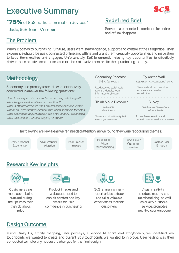
Snapshot of the project scope, insights, and final outcomes.
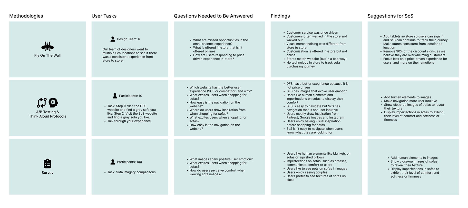
1. Empathize
Competitive Benchmarking
Method: Competitive Analysis
Top Competitor: DFS
Focus of Analysis: Omni-Channel Experience, Site Excitement and User Perceived Quality
Rationale: A Competitive Analysis was necessary because it showed a significant gap between ScS and its main competitor, DFS. DFS scored substantially higher in Omni-channel experience, Site Excitement, and User Perceived Quality.
Effectiveness: This gap immediately provided the "why" for the entire project: ScS needed research to understand how to close this functional and experiential deficit, making the subsequent steps of user observation non-negotiable.
Fly on the Wall: DFS
Method: Fly on the Wall
# of Locations: 2 DFS stores
Team: 5 UX Designers
# of Customers Observed: 15
Duration: 3 hours
Rationale: We noted that DFS effectively integrates technology in-store, successfully connecting users to the digital realm. Furthermore, we observed a high level of proactive staff engagement, with numerous team members readily available and willing to assist customers. Both stores experienced consistently high customer traffic across different times of the day.
Effectiveness: Based on positive body language, facial expressions, and observed purchases being finalized at both stores, we can conclude that customers were highly satisfied and validated with their overall experience. The DFS model demonstrates that a successful in-store furniture experience requires two key elements absent in our earlier ScS observations: proactive, available human assistance and a seamless, technology-driven bridge between the physical product and the digital purchase journey. The sustained high traffic and customer satisfaction observed at DFS validates the necessity of these integrated practices.
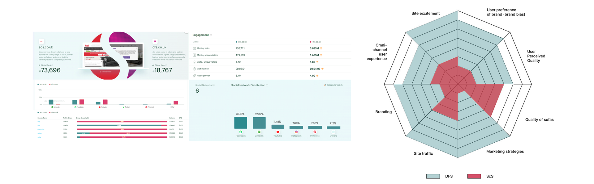
Competitive Analysis: DFS vs ScS
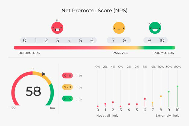
ScS NPS Score: 58
Fly on the Wall: ScS
Method: Fly On the Wall
Team: 5 UX Designers
# of ScS Locations: 2
# of Customers Observed: 15
Duration: 3 hours
Rationale: Our approach focused on directly capturing customer reactions to the physical environment to identify key missed opportunities in the omni-channel customer journey. We included two separate locations to ensure the findings were consistent and to effectively mitigate any location-specific bias. Quantifying the in-store experience involved tracking two core metrics: customer dwell time and qualitative data gathered from observing body language and facial expressions.
1st Location
The in-store experience at the first location presented severe, immediate barriers that resulted in a demonstrable failure of the purchase journey.
Critical Deficits Observed
Environmental Overload: The physical environment caused instant cognitive overload due to a disorganized, overstocked layout (stacked/obscured sofas) and excessive sales signage, preventing product viewing and comfort testing.
Service & Information Deficits: Staff were found to be largely disengaged and unhelpful. The store also failed to execute corporate policy: swatch books were hidden, and staff did not communicate customization options, leaving customers unaware of color change capabilities.
Broken Digital Journey: The purchase process was halted by a lack of digital integration (prohibited customer photography), forcing customers to rely solely on imperfect memory to finalize their decision.
Resulting Customer Behavior: Observation confirmed the destructive impact: customers consistently paused at the entrance in visible discomfort and quickly walked out. A significant portion never made it past the initial entryway. Those few who proceeded deeper received no staff assistance and rapidly exited within five to six minutes, underscoring a complete and rapid abandonment of the shopping experience.
2nd Location
The second store location yielded a noticeably better customer experience due to significant improvements in environmental flow and staff engagement, but it failed to reach its full potential due to core friction points.
Environmental Strengths and Staff Engagement
Improved Layout: Sofas were well-organized in a "living room" style layout, enhancing product viewing and interaction.
High Service Standards: Staff were very helpful, welcoming, and promptly engaged customers upon entry, confirming high service standards during our mystery shopping.
Remaining Deficits and New Friction Points
Customization Cognitive Load: While swatch books were visible, the sheer volume of color options within the thick books imposed a high cognitive load. Customers often only skimmed them for one or two minutes, suggesting dissatisfaction with the required manual effort for color selection.
Broken Digital Journey: The issue of digital integration remains unsolved. Staff continued to prohibit photography, preventing customers from capturing their preferred options and seamlessly continuing their purchase journey online.
Resulting Customer Behavior: Observation confirmed a notable positive difference in customer behavior, with prompt user engagement and assistance. However, the experience ultimately stalled because of the high manual effort required for color selection and the continuous roadblock of the broken digital journey.
Research Methods
ScS Imagery
Repeated Quotes from Survey
*92% of participants said these quotes or something similar
Question: How do you perceive these sofas?
"They look basic"
"I wouldn't buy any of these sofas"
"I don't like them"
"They looks stiff and uncomfortable"
"I can't tell if they would be comfortable or not"
"They are all on sale so they must not be great quality"
"They look very stiff"
ScS' Target Customer Imagery Preferences
Repeated Quotes from Survey
*100% of participants said these quotes or something similar.
Question: How do you perceive these sofas?
"I would buy some of these"
"They look really soft and comfy"
"They're durable and soft"
"They look very relaxing. I like that you can see all the details."
"They look really homey and comfortable. I like the texture."
Competitor A/B Testing with Think Aloud Protocols
Method: A/B Testing with Think Aloud Protocols
Survey Size: 10 participants
Sampling: College students and couples moving in together
Focus: DFS website vs ScS website user experience
Task: Find blue sofa and add it to cart while performing think aloud protocols
Rationale: We conducted A/B Testing for DFS and ScS. We wanted to observe which website users preferred and why as well as how easily they navigated each site. We had the participants think aloud to ensure we understood their thoughts and reasons as they navigated each site.
Findings
Emotional Connection: All participants found DFS' lifestyle imagery and images of sofas in context (with people/pets) evoke a stronger emotional response than ScS's more standard product shots.
Navigation & Search: ScS's site navigation was deemed too text-heavy and relied on industry jargon, making it difficult for users who were just starting their search or were unsure of terminology (e.g., "What is a chaise lounge?"). DFS's visual filtering was preferred by all participants.
Product Detail Page (PDP): Users felt ScS hid the true texture and potential imperfections of the sofa materials (e.g., fabric pilling, leather creasing). They all preferred the DFS approach of showing high-resolution zoom/texture images.
A/B Survey: Quantifying Emotional and Perceived Quality Gaps
Method: Survey & A/B Testing
Survey Size: 100 participants
# of Questions: 20
Sampling: College students and couples moving in together
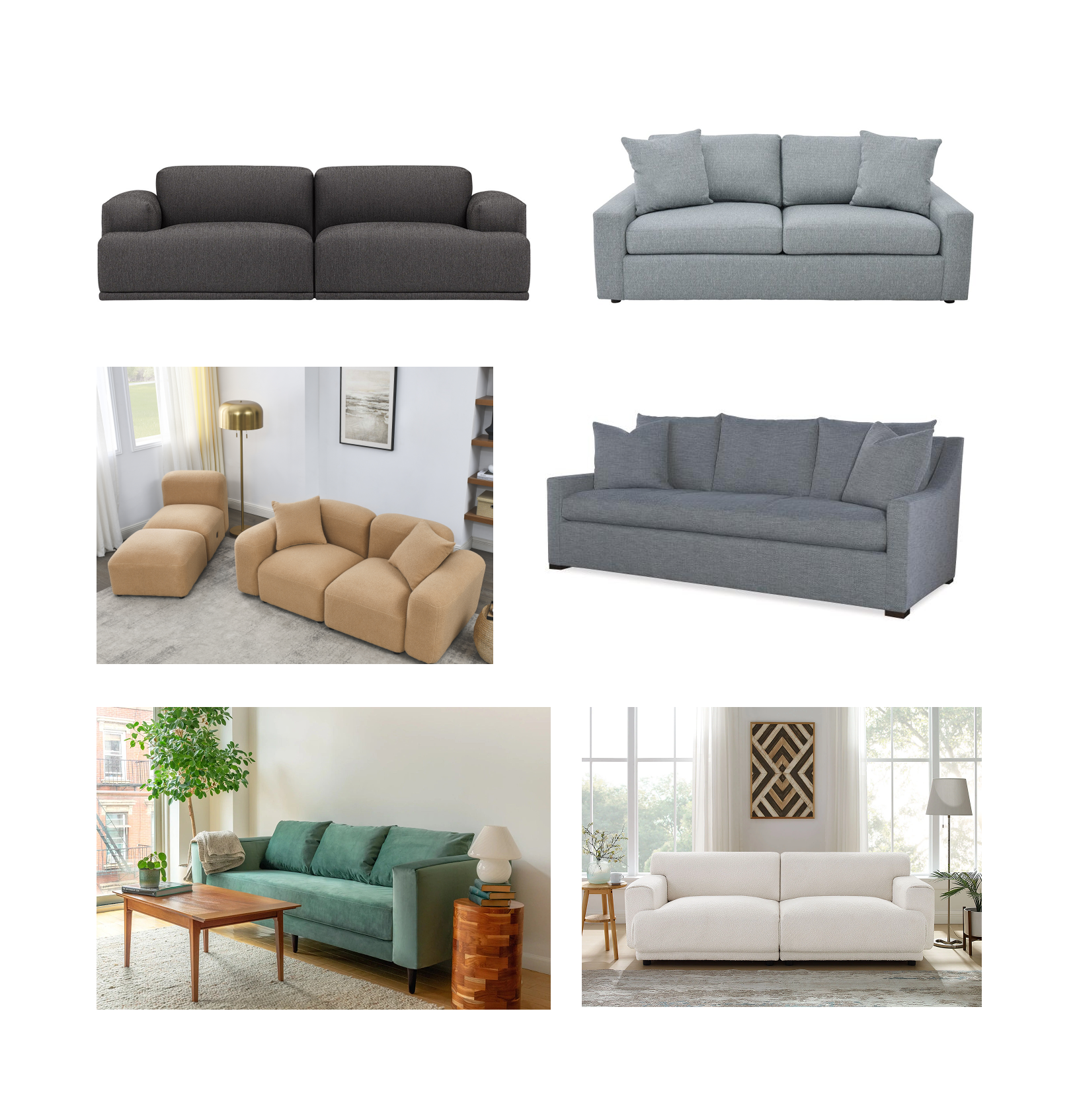
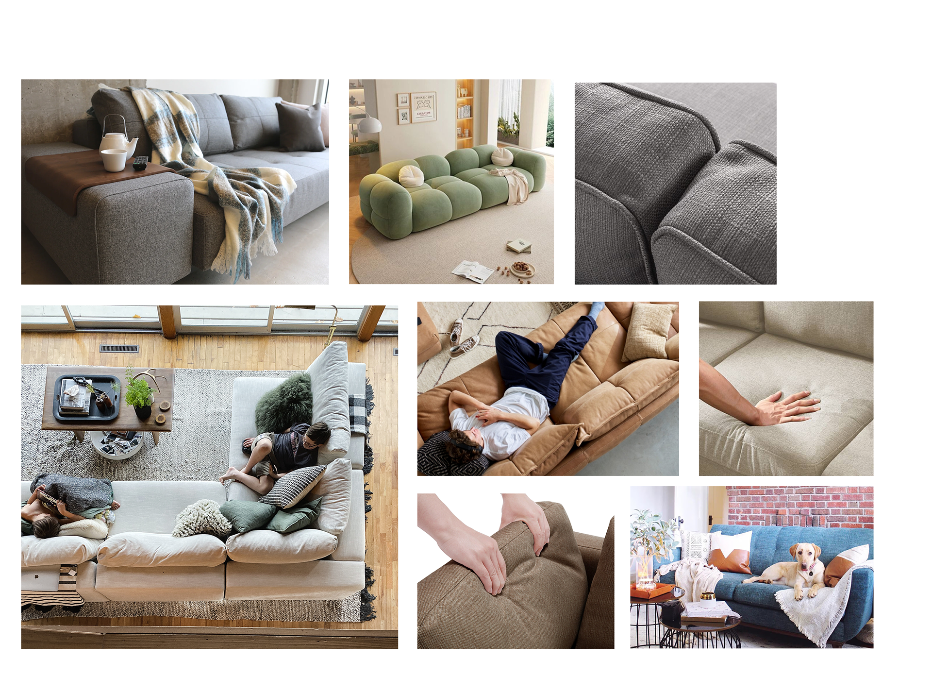
Rationale: The ability of visual assets to drive conversions cannot be overstated and imagery is the single most critical factor in supporting online furniture purchases. We determined that the existing ScS sofa imagery lacks necessary appeal, appearing static and uninviting. This omission is critical, as a sofa purchase is rarely purely transactional—it is an emotional journey, often tied to major life events (e.g., first home, new family setup).. ScS has a major gap in supporting the user's emotional journey through imagery.
To validate this assumption, we created a Google Survey to measure user preference. The survey directly compared the native ScS imagery against our proposed alternative: images that incorporate human elements and lifestyle context. The resulting data successfully quantified which type of imagery customers found most compelling.
Survey Results
Comfort & Scale: The highest-rated images featured people (especially couples or families) sitting comfortably on the sofa, which helps users gauge scale and visualize the fit. Detailed close-ups that visually demonstrate the softness or firmness of cushions and armrests were also highly valued.
Texture & Material Trust: Participants found low-resolution images misleading. They required high-resolution, intense focus on material details—such as the weave of the fabric, the leather grain, or the stitching—to accurately judge the physical feel and quality of the sofa material.
Emotional Connection: Images that depicted a cozy, "lived-in" environment (e.g., including props like blankets, books, or ambient lighting) were most effective in creating a positive emotional connection and enhancing the sofa's perceived value.
Diagnosing the Omni-channel Breakdown
These methods confirmed that customers were forced to "restart their purchasing journey" when moving from the website to the store. By observing this behavior and asking users to "talk through their experience", the research provided concrete evidence that the lack of technology to track the sofa purchasing journey was causing customer abandonment and was a significant failing compared to competitor experiences.
2. Defining Findings
Why We Skipped Affinity Mapping
Due to the high consistency of data gathered from participants, coupled with our complementary primary research experiences, we were highly confident that the problem was clearly defined and understood. We were thus prepared to immediately advance to the development of our Key Insights.
Key Insights
Despite the usual complexity involved in deriving Key Insights, our team felt immediate confidence. The strength and consistency of our primary research observations ensured that all evidence pointed directly to the same conclusions.
Key Areas of Improvement
Our team effectively implemented solutions to improve ScS's user experience by addressing user pain points found in primary research.
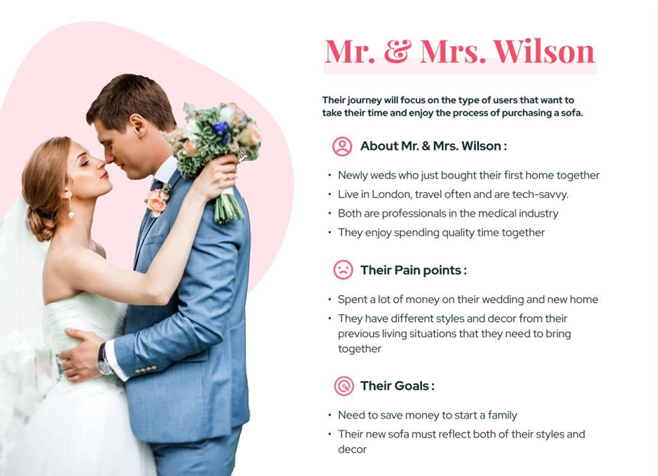
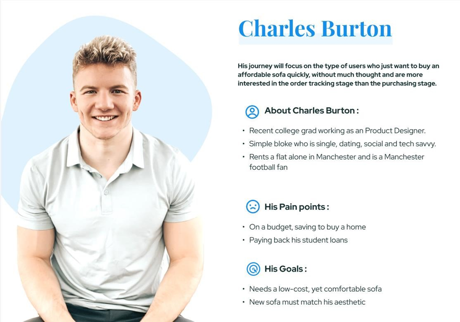
Personas
Our findings, derived from in-store observation and collaboration with the ScS team, revealed the existence of two primary customer archetypes. Creating two distinct personas for these segments is the recommended strategic practice to ensure the development of empathetic and targeted solutions.

Persona 1
Persona 2
Redesign Strategy
Close the Omnichannel Gap
The primary strategy is to eliminate the disconnect between the online and physical store experience. The research found that customers must restart their journey when switching between the website and the showroom, which is a significant point of friction.
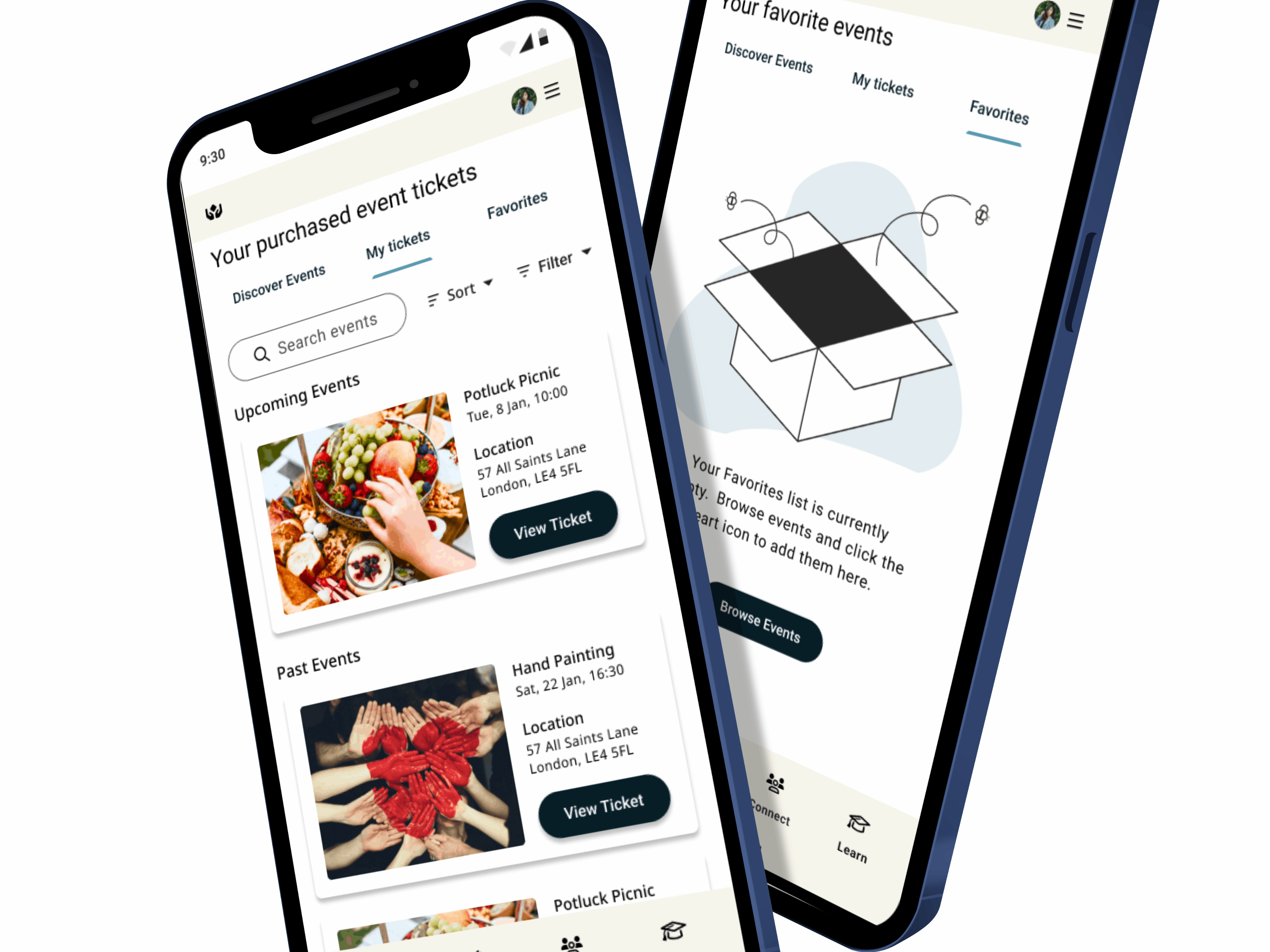
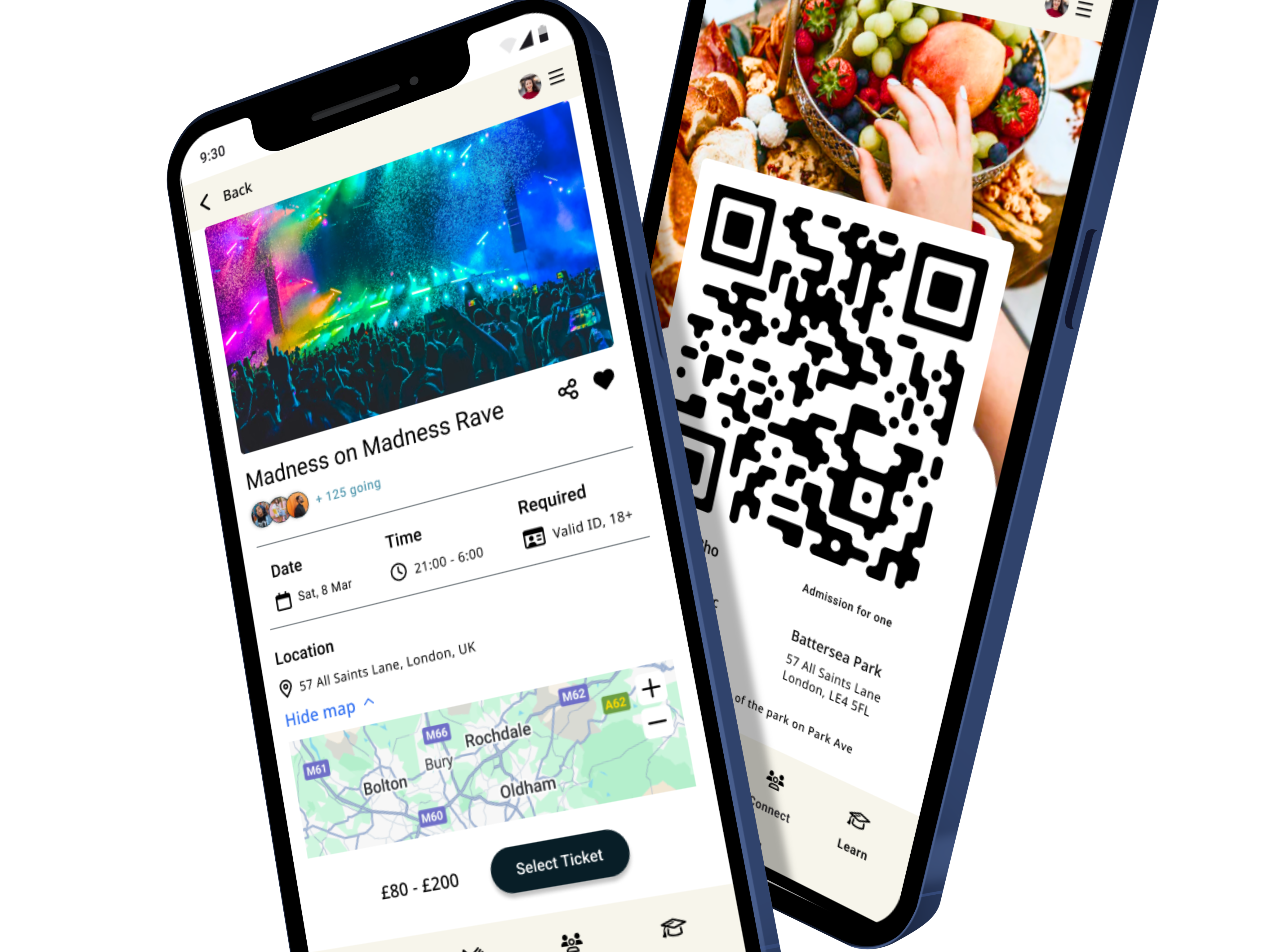
Action: Implement features that allow customers to seamlessly track their purchasing journey, regardless of channel.
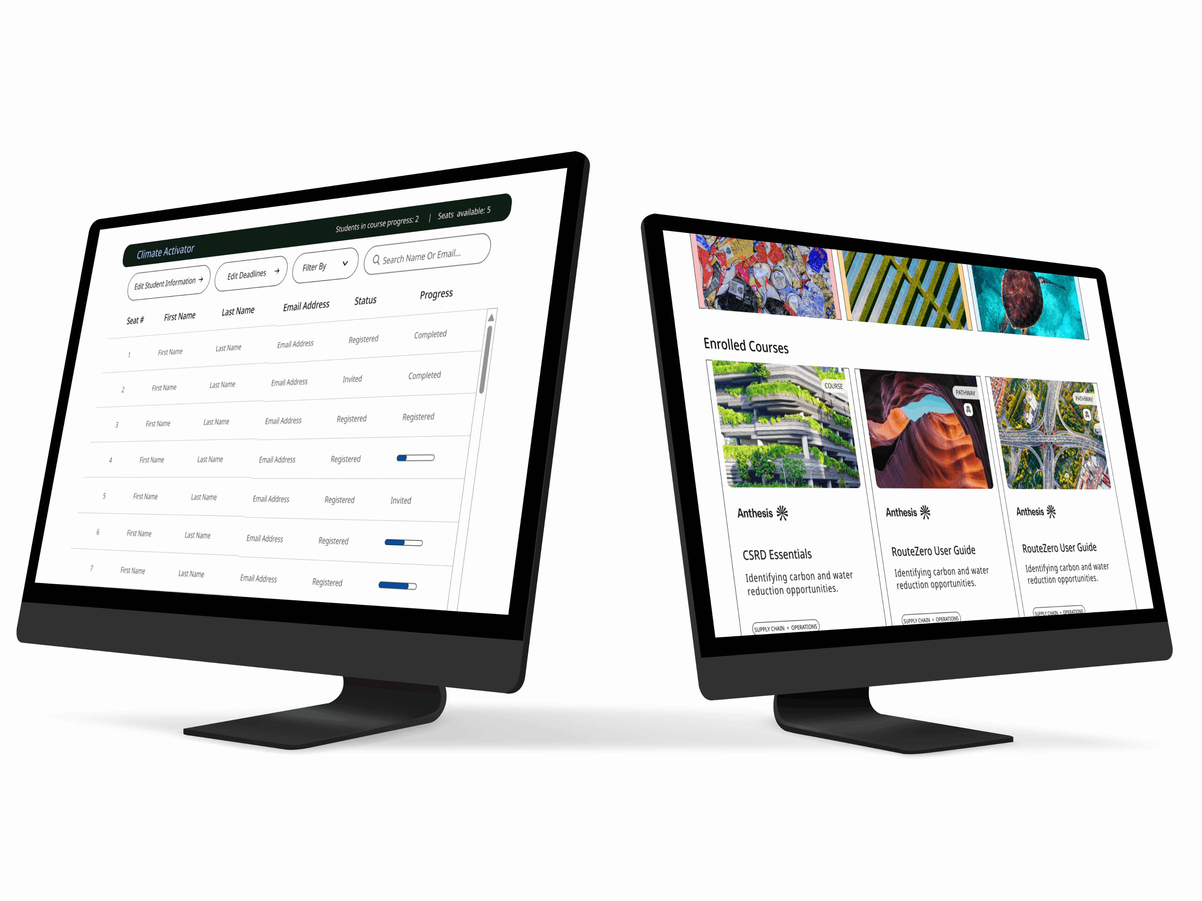
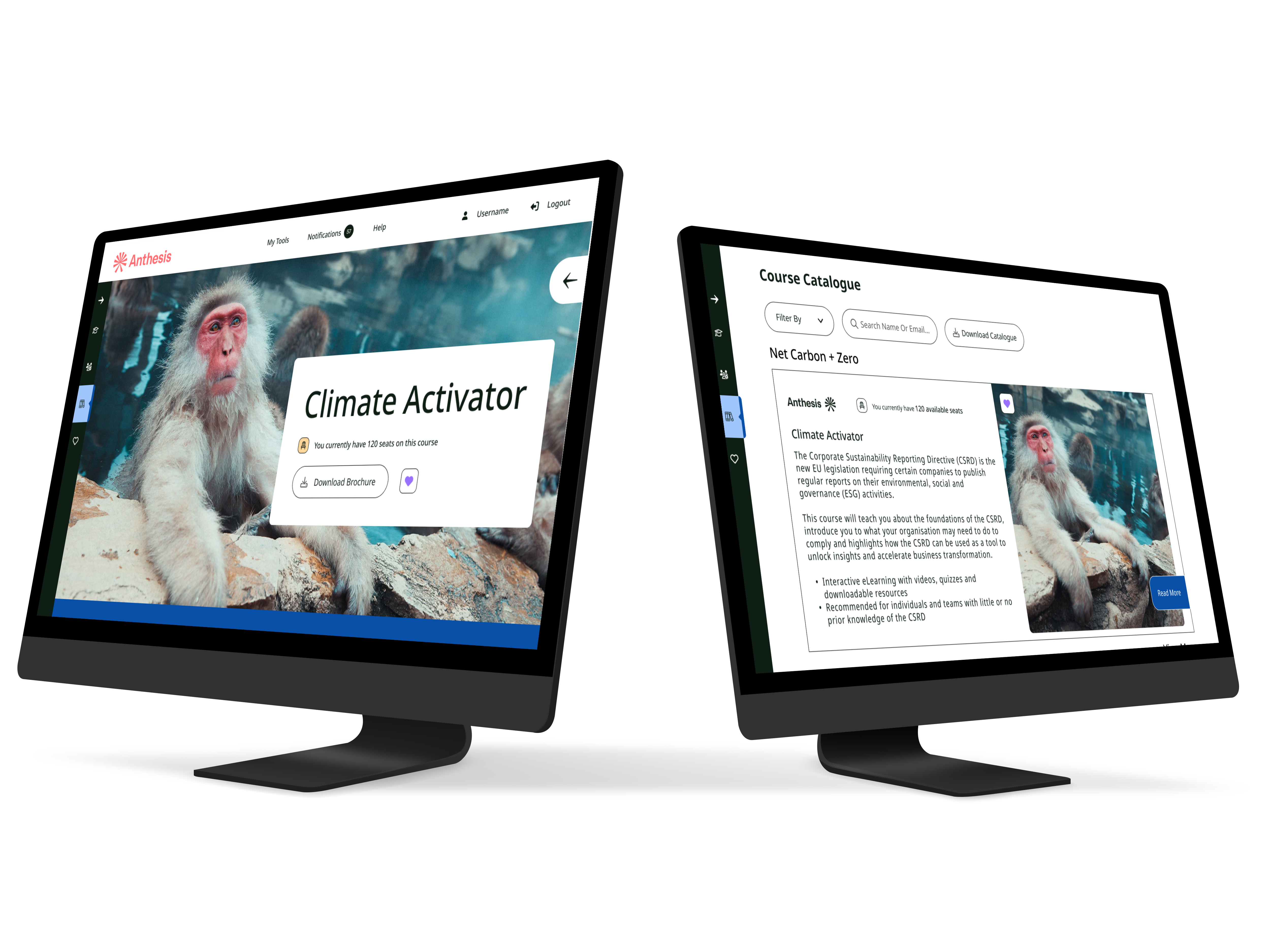
Recommendation to ScS: Add tablets in-store where customers can log in, access their saved sofas from the website, and continue their search where they left off. This ensures a single, continuous user flow from digital browsing to physical consultation.
Prioritize Emotional and Relatable Imagery
The redesign must overhaul the visual presentation of sofas to trigger positive emotional responses and build confidence in quality. The survey of 100 users confirmed that images are the most important aspect of e-commerce, and the current ScS imagery falls short compared to competitors like DFS.
Action: Replace current static, product-focused images with personable imagery that displays human elements and imperfections.
Rationale: Users prefer images showing people relaxing on the sofa, children, pets, or comfort elements like blankets. This communicates comfort and relatability, which helps users visualize the sofa in their own homes and reduces the perceived risk of an online purchase.
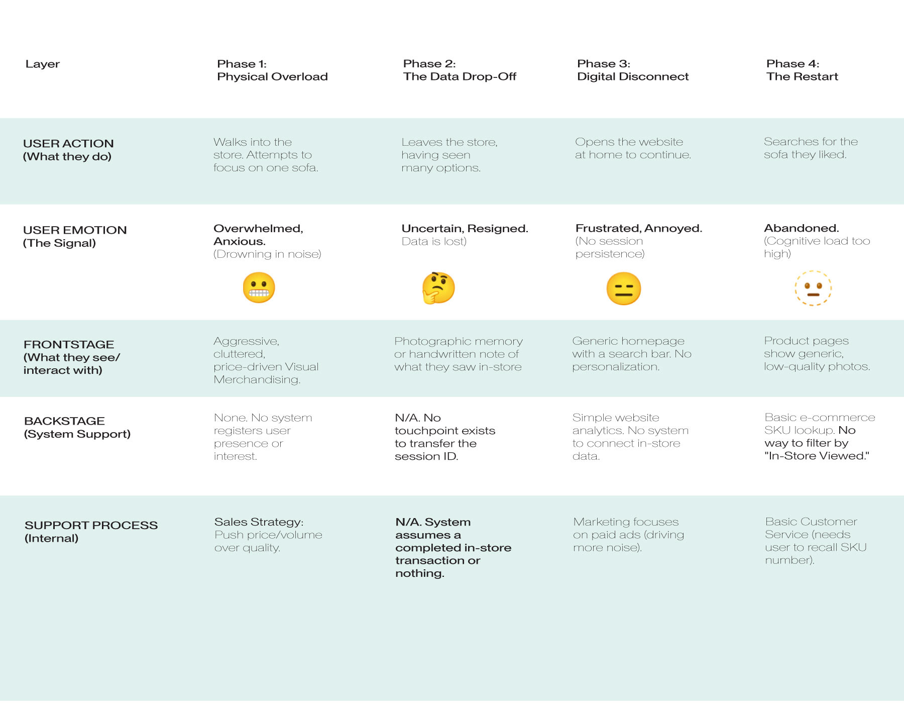
Service Blueprint (Before)
3. Ideation
Omni-Channel Bridge & Customer Journey Care
In order to get the team on the same page and ensure everyone was heard, I facilitated a brainstorming workshop where all members of the design team conducted Crazy 8s. The Crazy 8s session was geared to provide ways we could relieve the friction points for users. After we completed this, we collectively chose designs and ideas that the majority felt would solve the key issues.
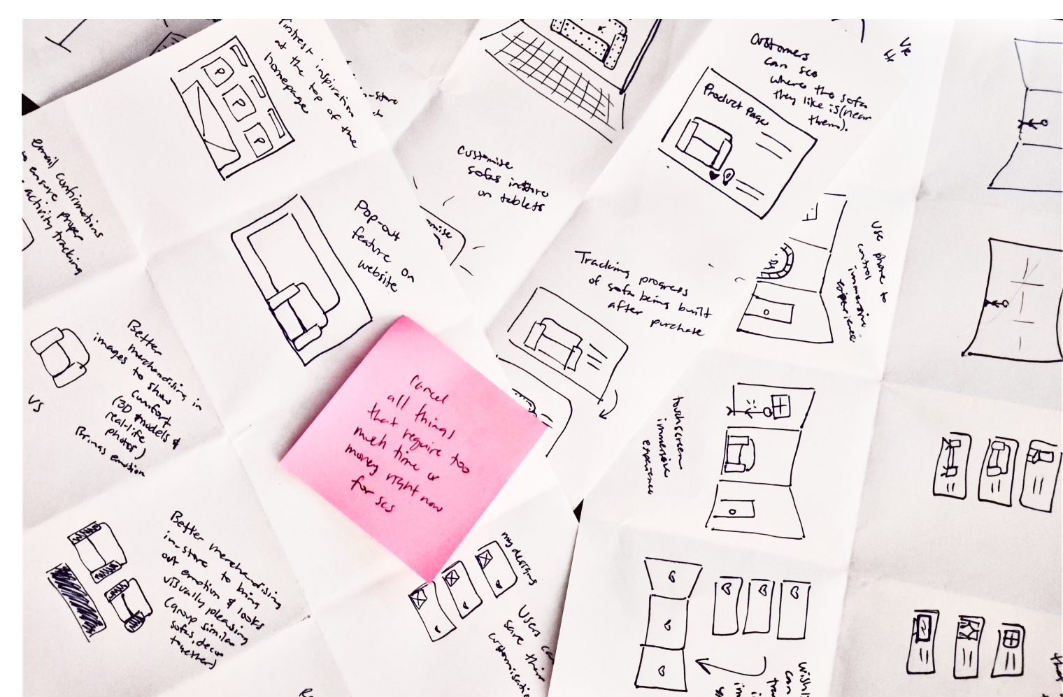
Crazy 8s
Ideal State User Journey: The Omni-Channel Bridge
Following the Crazy 8s ideation session, we needed to validate how our proposed features would function as a cohesive ecosystem rather than isolated add-ons. We mapped the "To-Be" journey for our primary persona to visualize the new "Omni-Channel Bridge."
This journey map illustrates how the QR Code integration and AR features specifically dismantle the "Restarting Journey" friction point identified in research. It proves that by allowing users to carry their in-store preferences home via the app, we transform a fragmented transaction into a continuous, confidence-building relationship.
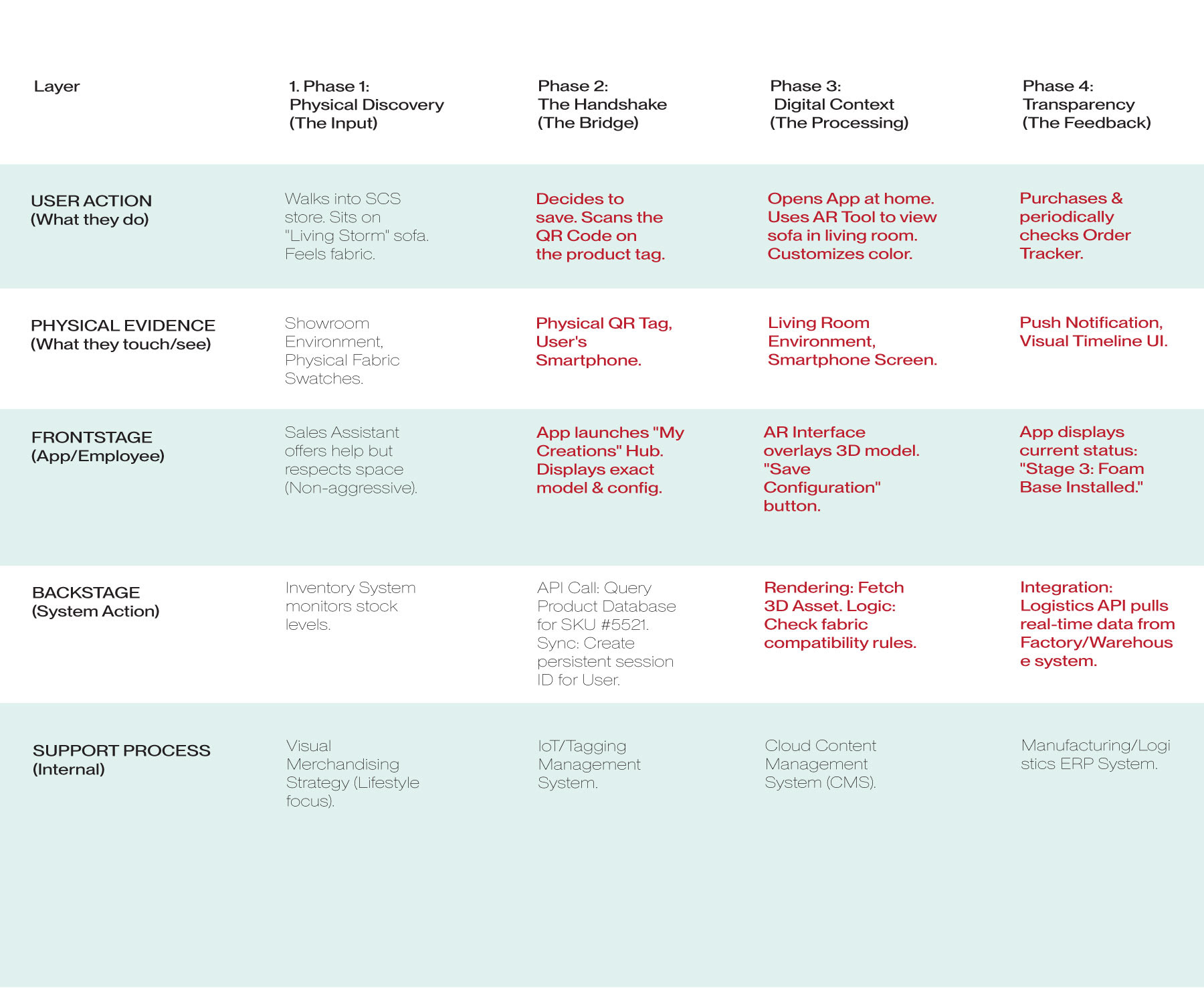
New Service Blueprint
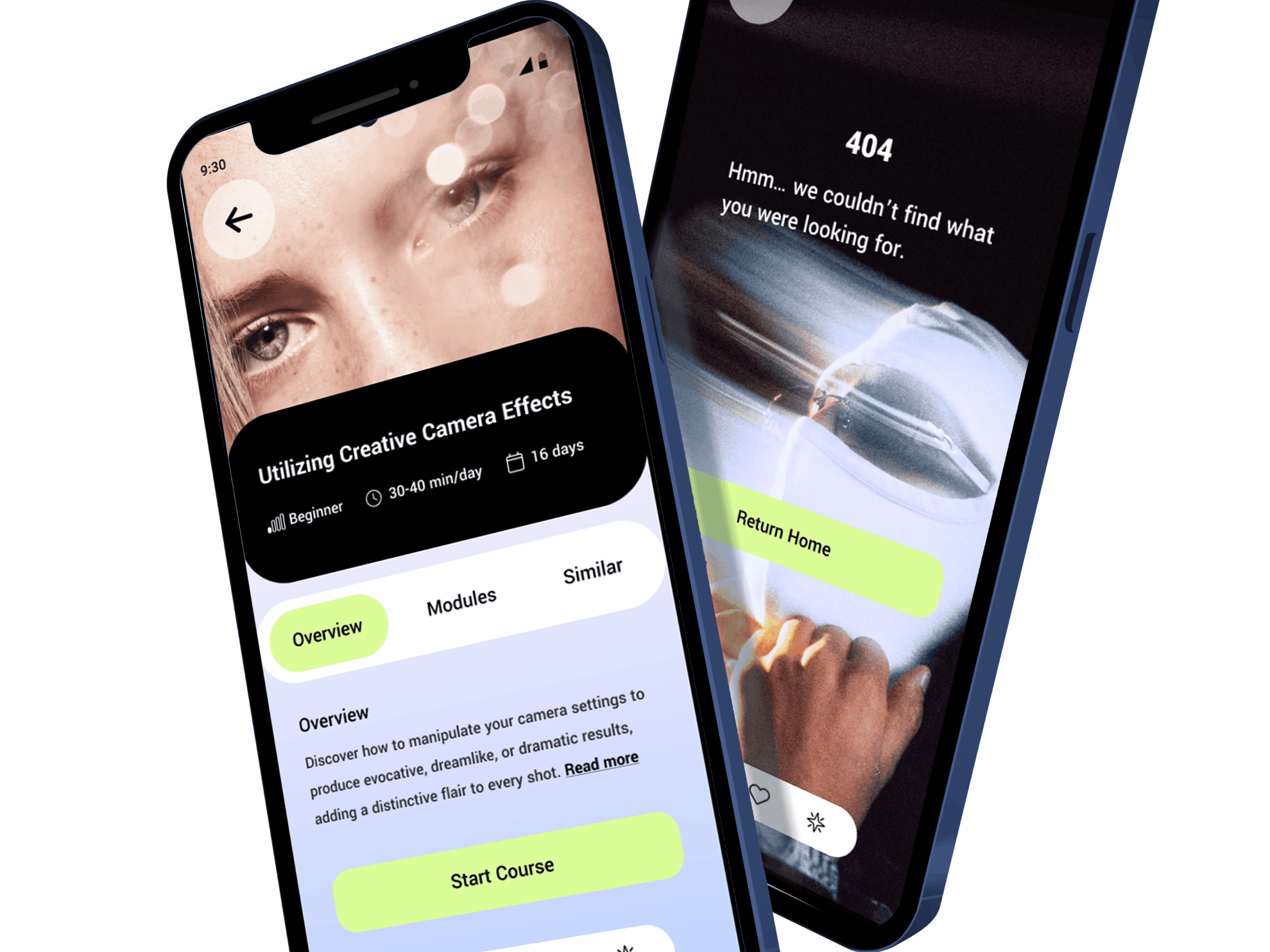
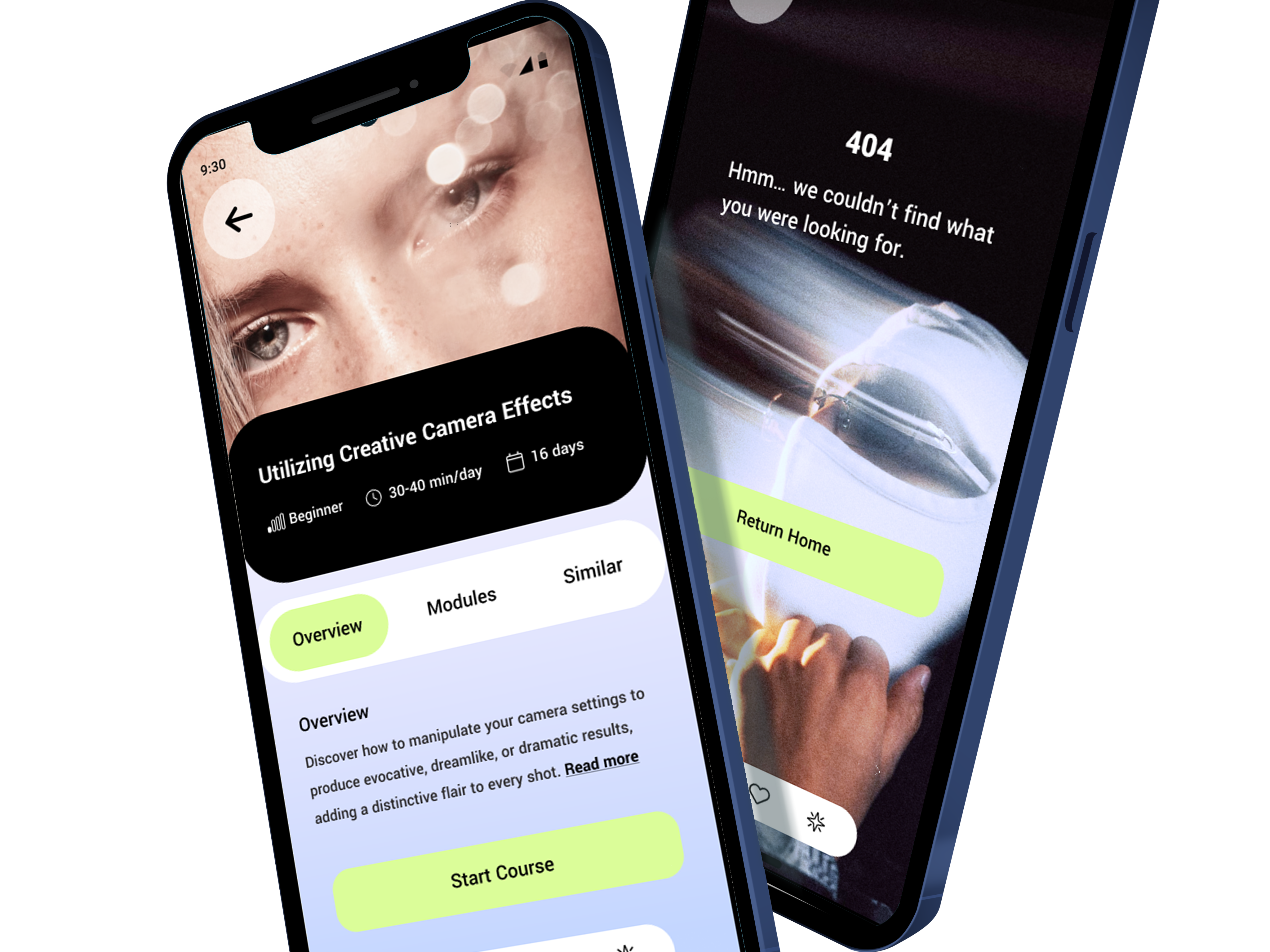
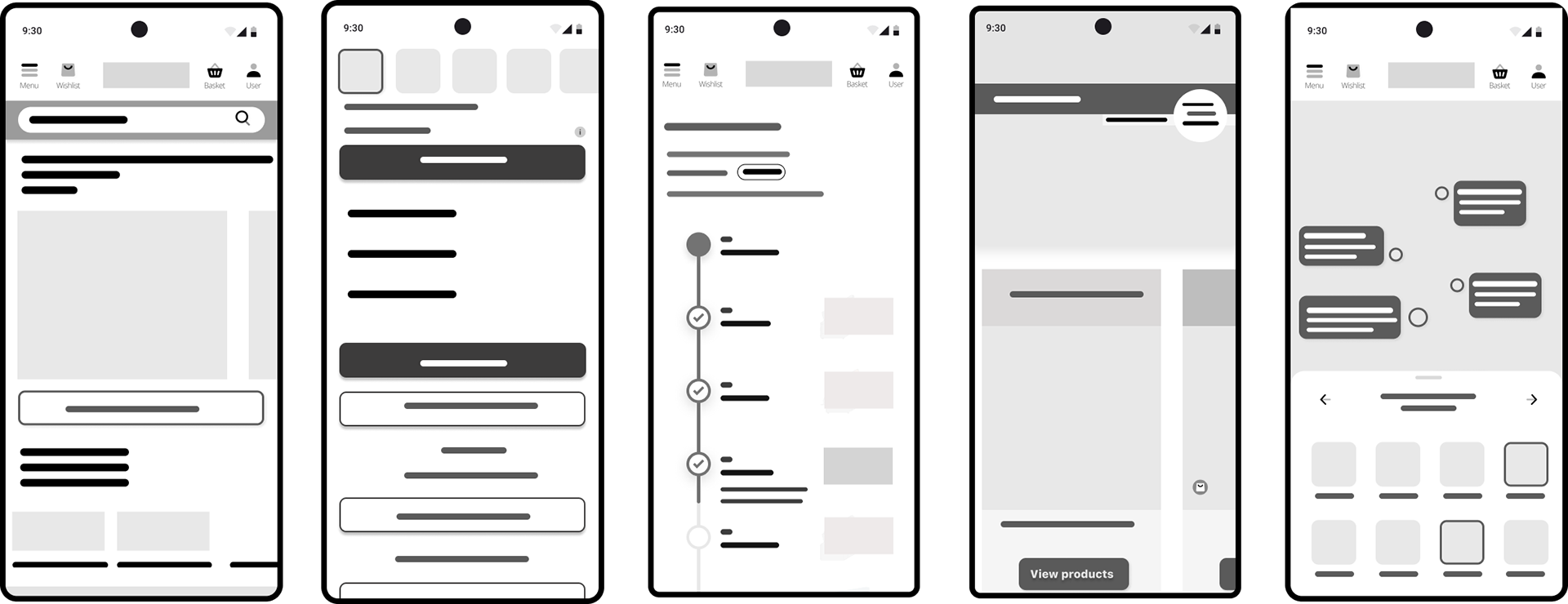
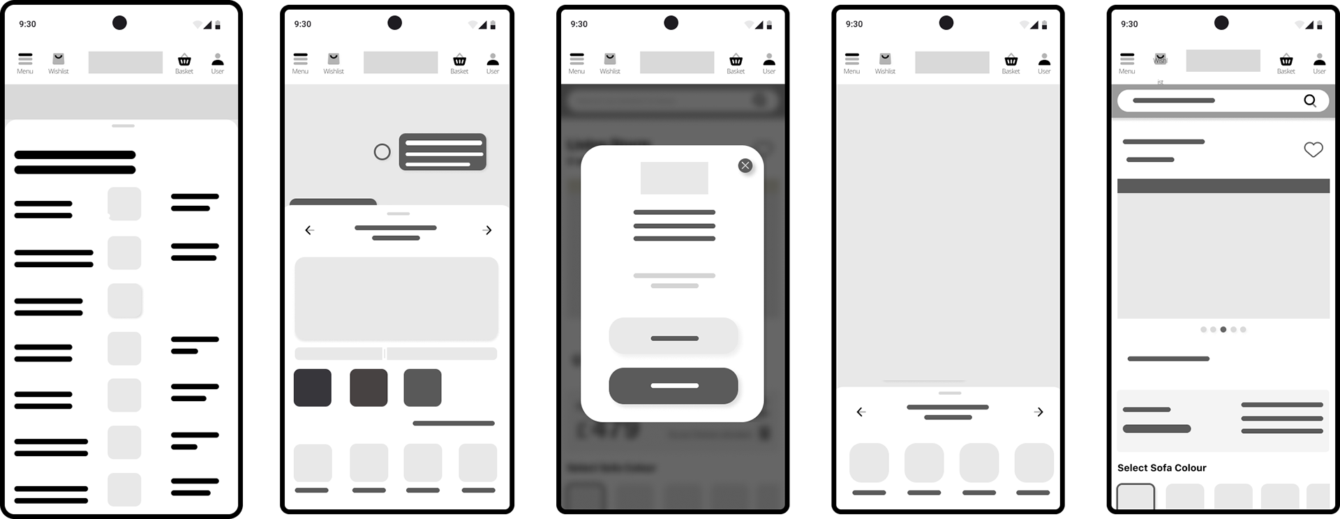
Low & mid-Fidelity Wireframes
The Crazy 8s session provided rapid ideation and a definitive direction for our solution. To move this concept forward, we immediately moved to prototyping by sketching out low-fidelity wireframes. The purpose of these initial wireframes was two-fold: to formalize the chosen user flow and to quickly test how the abstract ideas generated during the sketching exercise would render as a structural digital experience. This allowed us to quickly determine the viability and look and feel of the intended solution.
Upon confirming the basic structural flow, we progressed to mid-fidelity wireframes. We introduced key elements such as precise layout, typography, and clear labels to solidify the content hierarchy and ensure the design's usability. Moving to mid-fidelity was essential because it provided the necessary detail—beyond simple sketches—to conduct hallway testing effectively and confirm that the user experience was both practical and intuitive.
4. Prototyping
Storyboards & High-Fidelity Features List
The team's primary objective was to secure stakeholder approval for the strategic direction. We initiated this process with detailed presentations, utilizing persona-based storyboards to clearly illustrate our concepts and the intended user journey. To maximize buy-in, particularly given prior budget reservations, we strategically chose to present high-fidelity screens alongside the feature list. This ensured stakeholders could experience the final aesthetic and functionality before commitment. We did inform them that necessary tweaks would be made depending on user testing results.
Following this validation, we prepared the final stakeholder check-in. We presented the tested flow and our key discoveries, and after stakeholders expressed their satisfaction, we received the greenlight to proceed with the final product build.

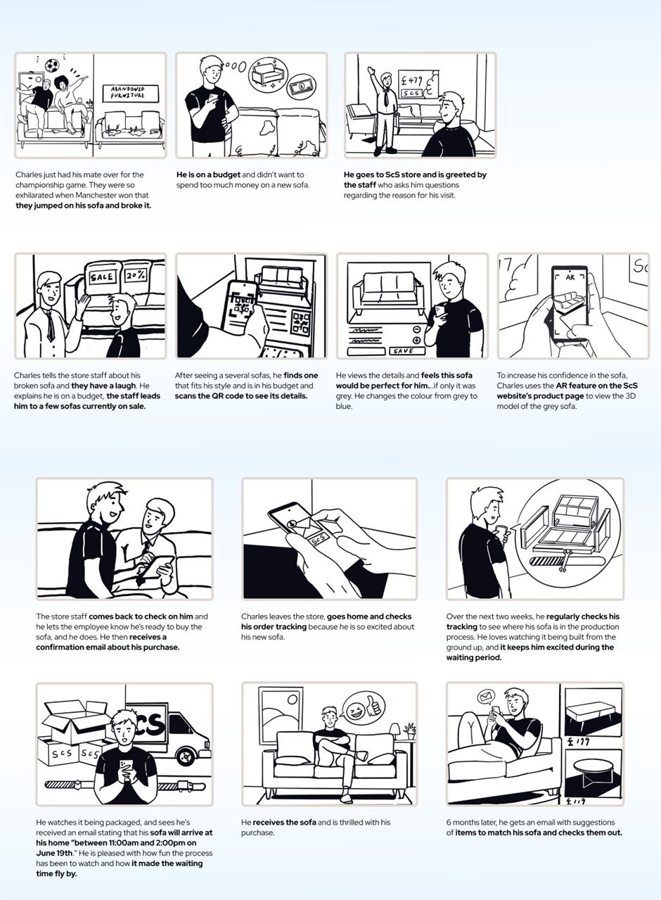
Persona 1 Storyboard
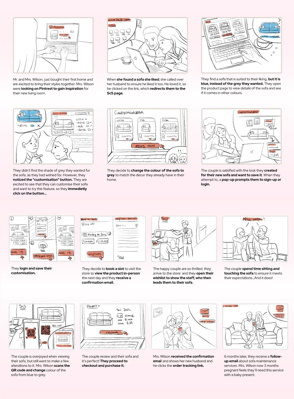
Persona 2 Storyboard
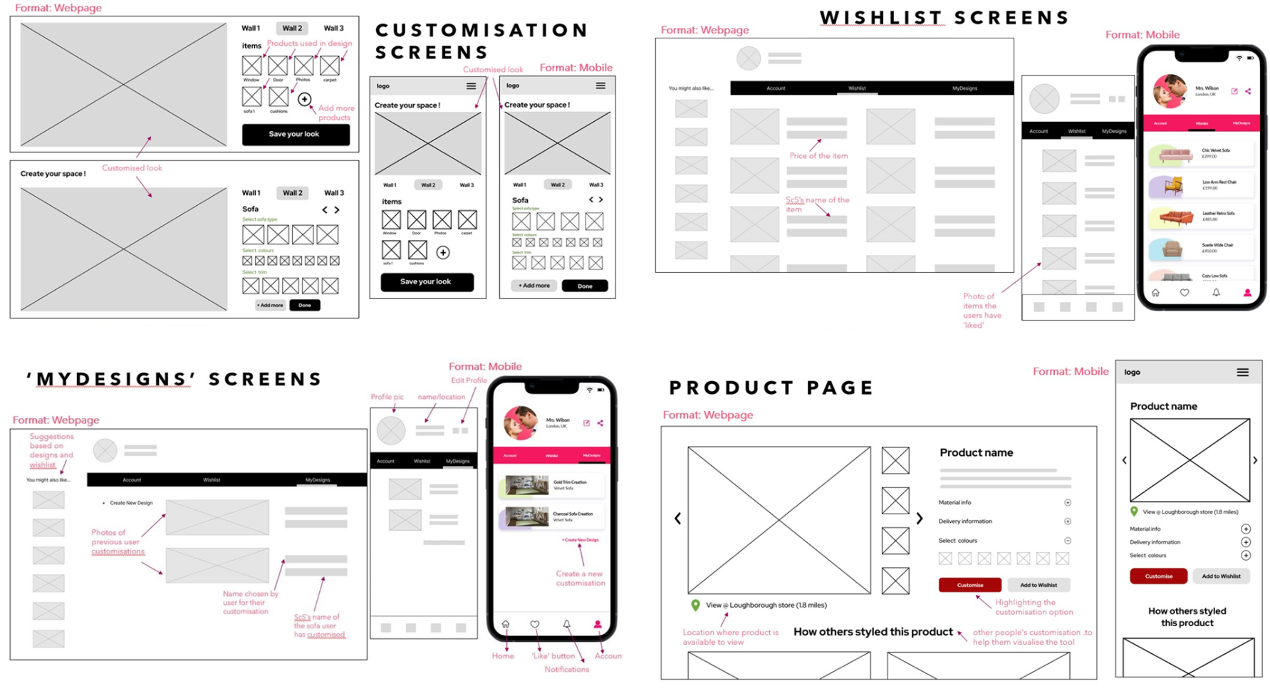
Features List (First Iterations): Omni-Channel Bridge & Customer Journey Care
With time to design, test and implement being limited, we knew we had to figure out which features would be prioritized. We used the MoSCoW tool to identify the 'Must Haves' and 'Should Haves' which were the most important features that SCS needed immediately to enhance user experiences in the redesign and omni-channel user flow.
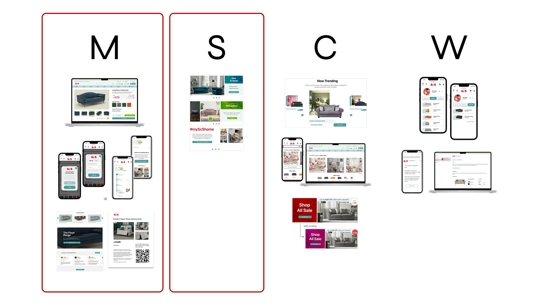
MoSCoW Prioritization Tool
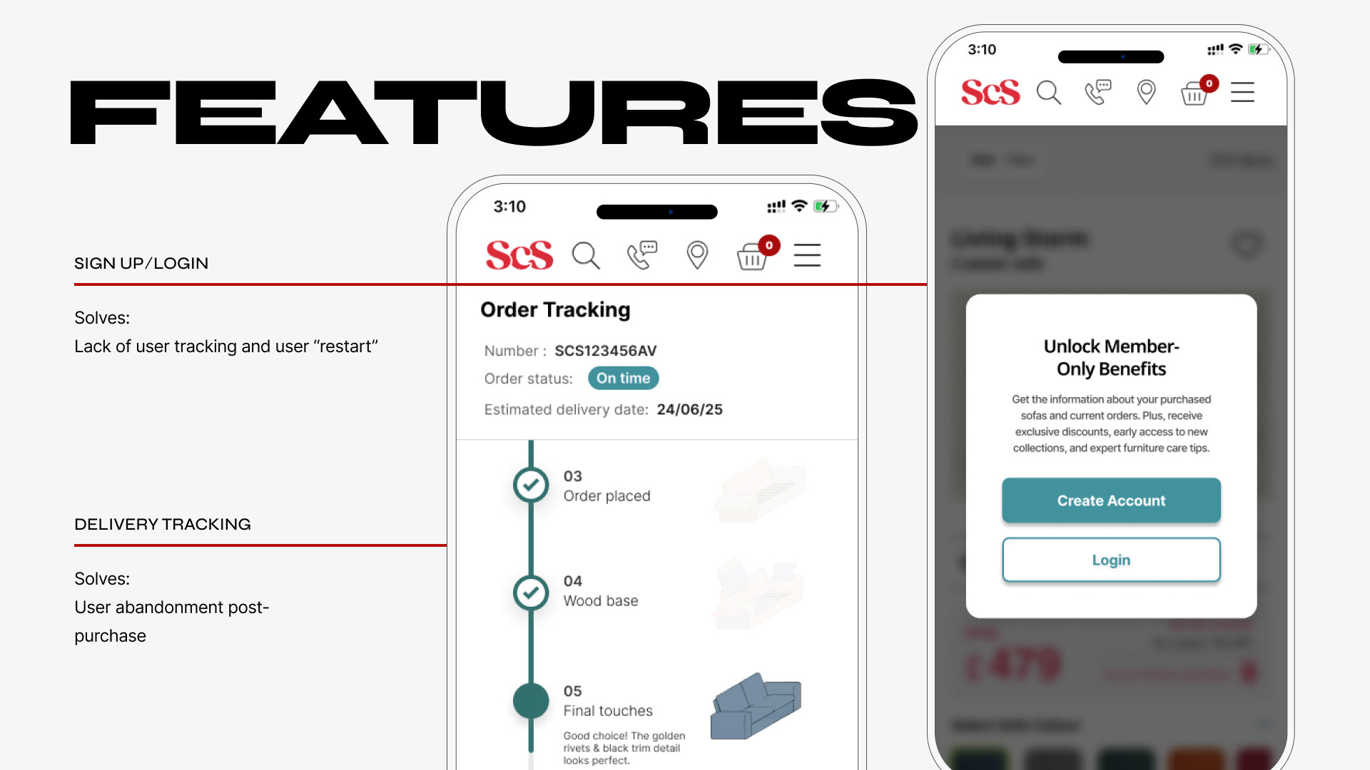
Delivery Tracking & Signup & Login Features
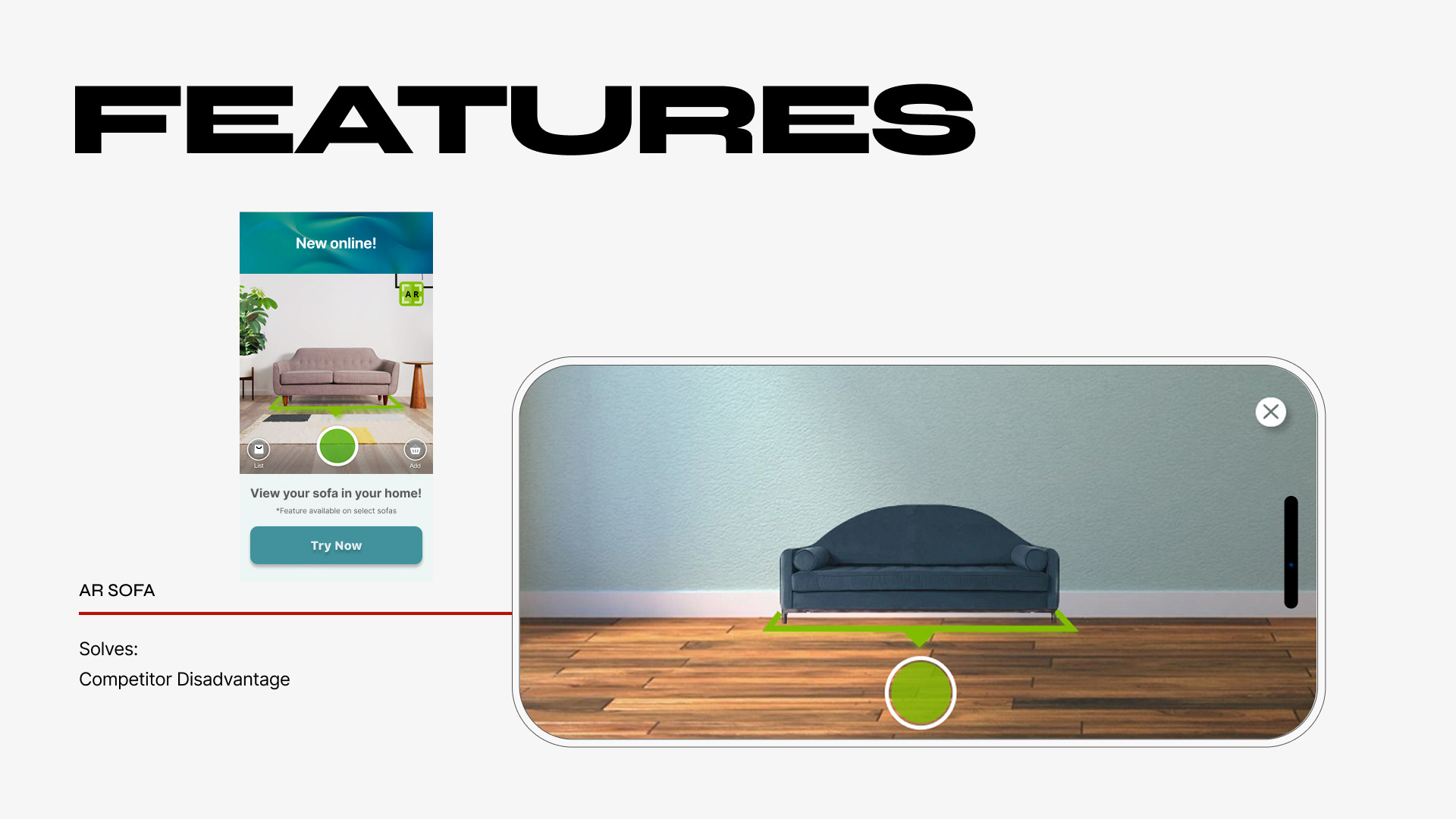
AR (sofa in home) Feature
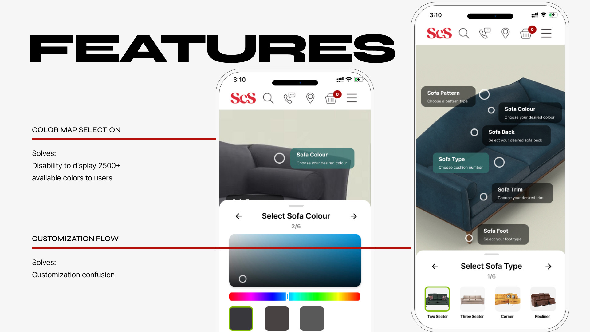
Color Map Selection & Customization Flow Features
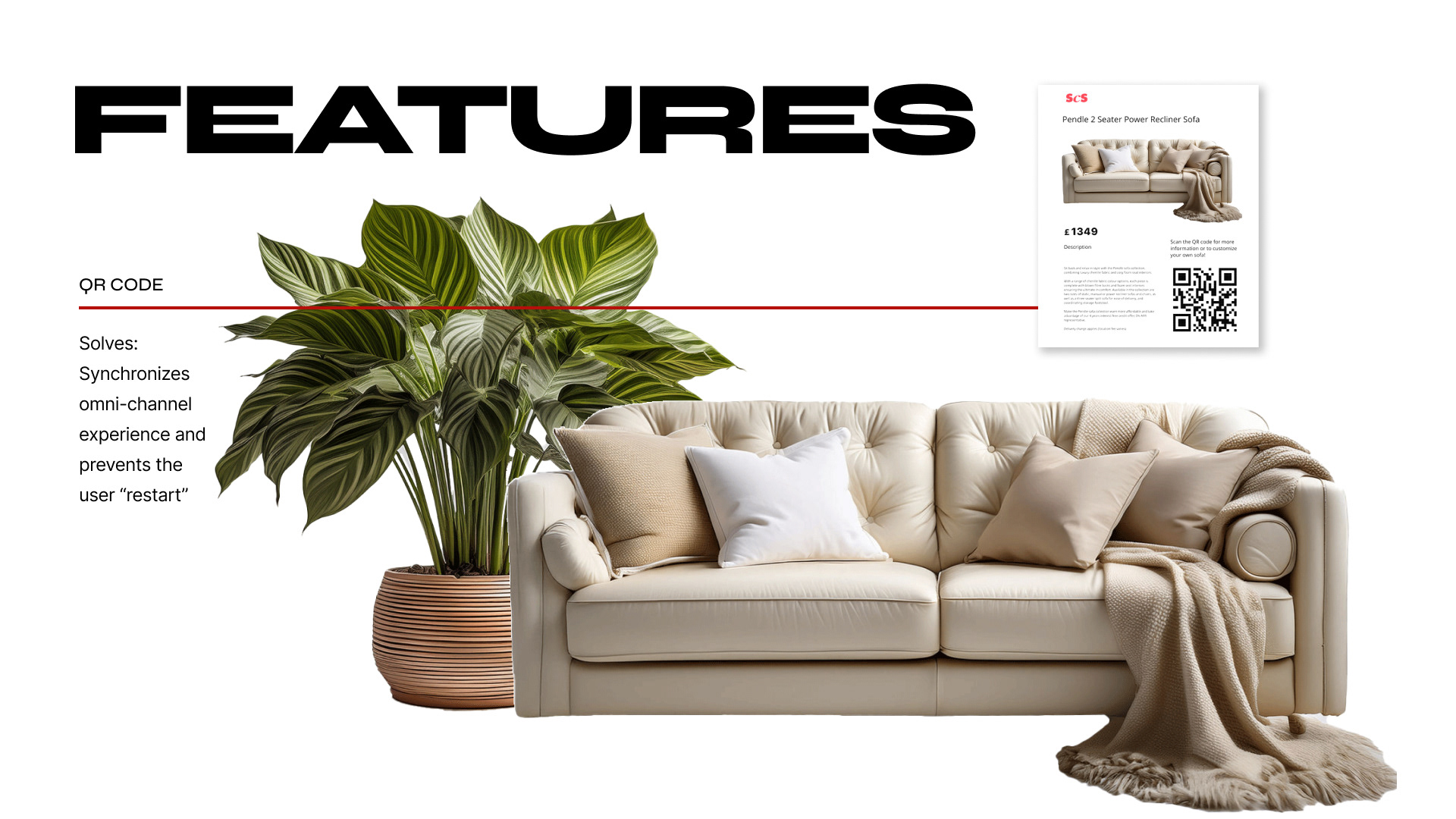
QR Code Feature (to be scanned in store, connecting users to digital platform)
User Flow Prototypes (First Iteration)
5. Testing
High Fidelity Prototype Testing
Our validation strategy was highly focused. Since the core challenge wasn't a usability issue (we utilized standard e-commerce patterns), but rather one of brand trust and emotional resonance, we channeled our iteration cycles directly into high-fidelity prototype testing. This allowed us to quickly validate critical visual variables—like the new lifestyle imagery and emotional design focus—where the highest risk to business outcome lay.
User Flow Prototypes (Final Iterations)
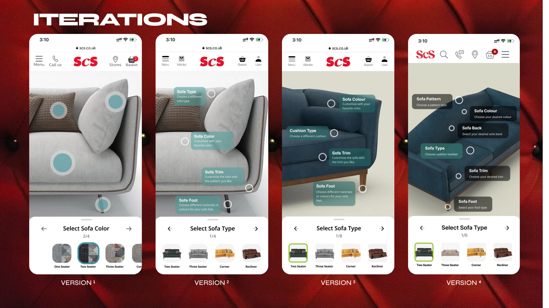
Example of iterations made based on rounds of testing
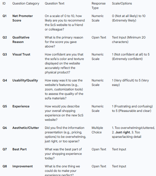
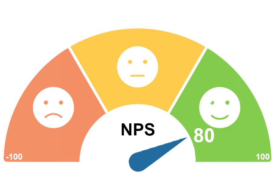
Positive NPS
Method: NPS Survey & Scoring
Survey Size: 100 participants
Sampling: College students and couples moving in together
Focus: User Satisfaction with Redesign
Survey Size: 100 participants
Sampling: College students and couples moving in together
Focus: User Satisfaction with Redesign
Tasks: Browse Landing Page, Find a Sofa to Customize, Successfully Customize It and add to your Wishlist
By deliberately bypassing lower-fidelity testing for this phase and moving to testing on a finalized aesthetic, the team ensured the feedback was highly relevant. We also asked open ended questions for qualitative feedback in addition the the quantitative data.
Accurate Data: The findings accurately reflected customer reactions to the finalized aesthetic and visual hierarchy. This means the resulting design changes were based on how customers would actually experience the launched product, minimizing the risk of post-launch issues.
Reduced Friction: Successful validation meant the final design offered a seamless, intuitive, and visually appealing user experience. When customers can easily find, configure, and confidently purchase a sofa, the transaction is smooth and satisfying.
NPS Score Calculation:
85 Participants scored 9 or 10 (Promoters - 85%)
10 Participants scored 7 or 8 (Passives - 10%)
*Passives are not calculated into score
5 Participants scored 0 to 6 (Detractors - 5%)
NPS = (%Promoters) - (%Detractors) = 85% - 5% = 80% x 100 = 80
6. Results
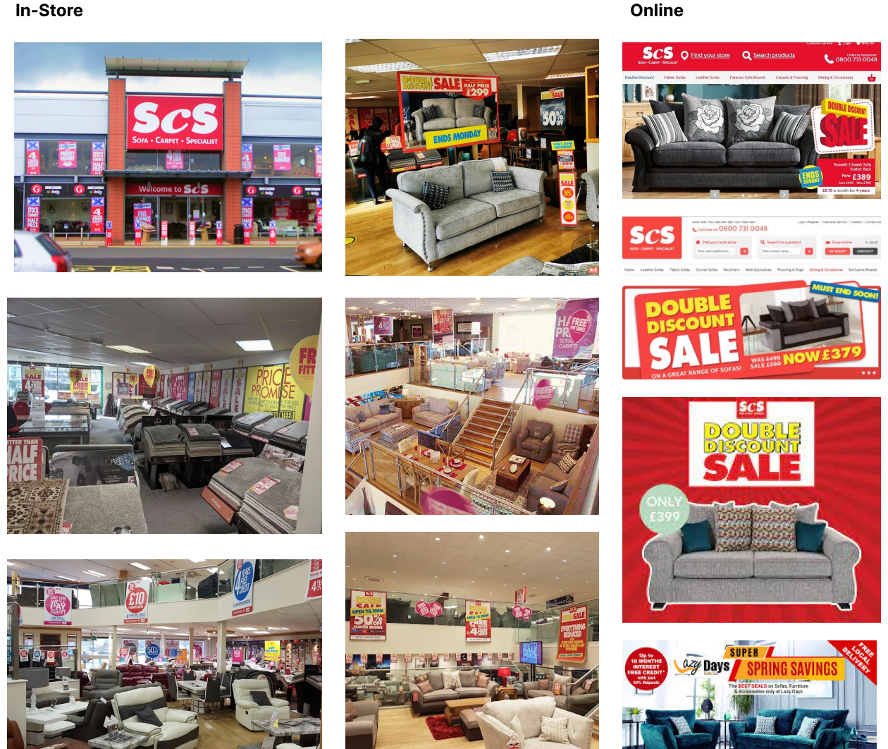
ScS: Before Our Help
ScS struggled in their marketing, promoting price rather than the quality of their sofas. Their excessive signage and even their commercials screamed at the user rather than speak to their emotions.
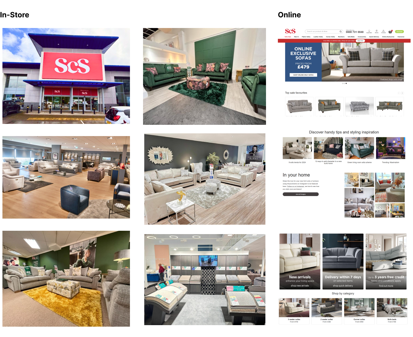
ScS: After Our Help
After listening to our advice about shifting from a price-driven experience to an emotional one, ScS has found a 20% increase in annual sales, 60% increase in conversion for product customization, enhanced brand equity, and strengthened customer relationships.
Personal Reflection
This project pushed me out of my comfort zone, forcing me to adapt quickly to the complexities of an omni-channel rebrand. It was a humbling experience that required me to lean heavily on my background in Visual Merchandising. By translating the "feeling" of an in-store visit into the digital space, I learned how to create a journey that wasn't just functional, but emotionally resonant for the customer.
The steepest learning curve, however, came from the team dynamic. When we faced a significant dip in motivation, I realized that I couldn't just push for output; I had to change my approach. I shifted my role from just "Lead Designer" to "Facilitator and Coach," focusing on empowering individual strengths rather than just managing tasks. This experience taught me that true leadership is about lifting others up—fostering a collaborative environment where everyone feels safe to contribute their best work.
Ultimately, this project was a lesson in resilience. It equipped me with a deeper understanding of cross-channel strategy, but more importantly, it proved that a supported, aligned team is the strongest asset in delivering a successful user experience.