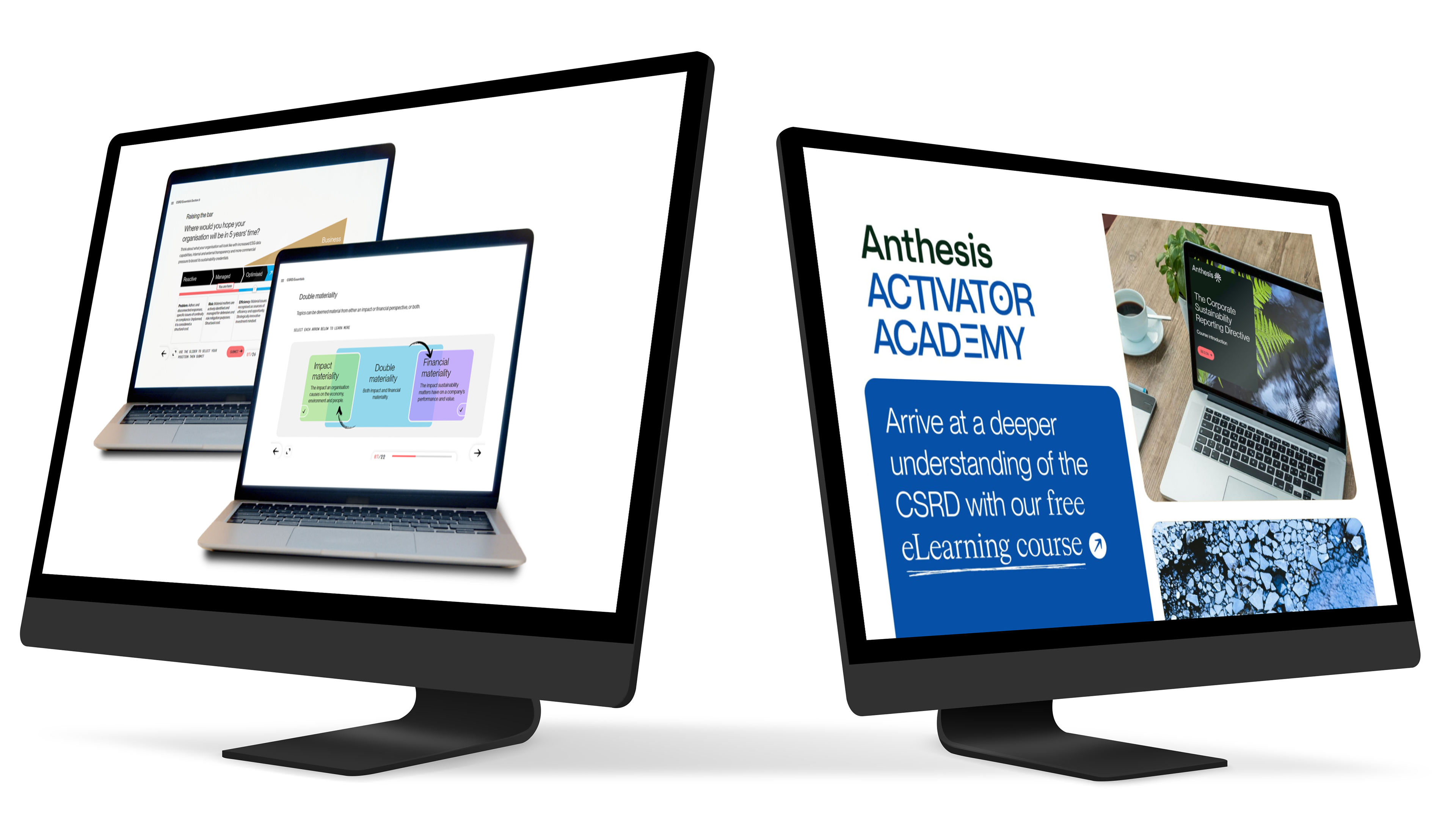
Activator Academy
Brand
Anthesis Group
Role
Product Designer in Cross-Functional Team
(Devs, Product Owner, Product Manager, Marketing)
Target Group
Businesses looking to reduce their carbon footprint
Contribution
Research, insights, analysis, concept, testing, design
Brief
Design and launch an MVP for a consulting company’s e-learning platform. The platform should helps clients understand their carbon footprint, get informed about sustainable practices, and implement actionable changes.
Outcome
Collaborating closely with a Business Owner, Software Developers, a Marketing Team, and a Product Owner, I designed a user-friendly B2B, MVP e-learning app for Anthesis Group that helps clients understand and reduce their carbon footprint. This platform has been well-received, attracting over 500 new users in its first year, including several prominent brands committed to sustainability.
Open Side Navigation Bar
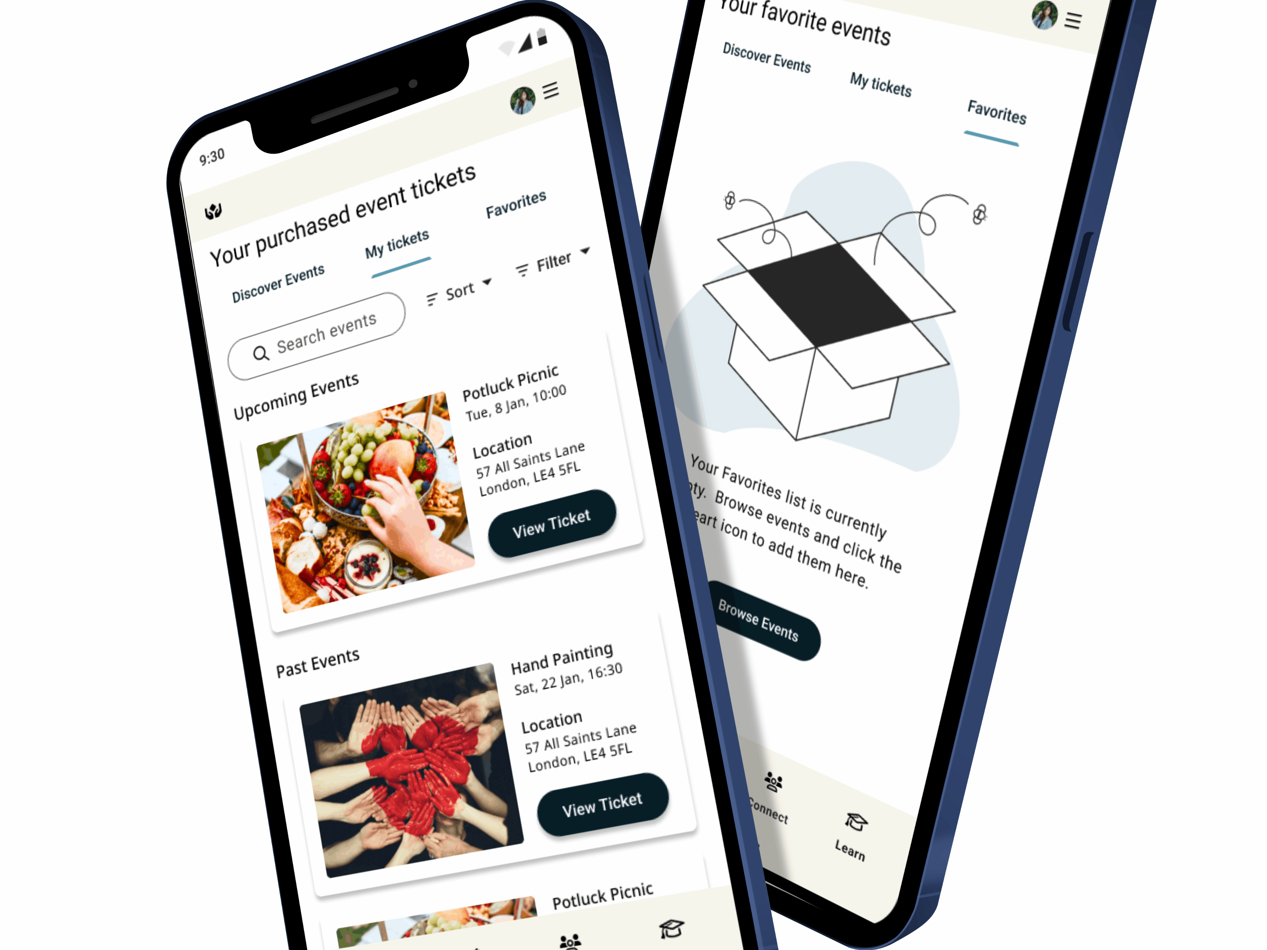
Wishlist
1. Empathize
Secondary Research: Competitive & Expert Review
My secondary research centered on a Competitive Expert Review, comparing the proposed solution (Anthesis) against industry peers (Bambuu and ERM). This provided crucial market context and validated the need for the product.
My secondary research centered on a Competitive Expert Review, comparing the proposed solution (Anthesis) against industry peers (Bambuu and ERM). This provided crucial market context and validated the need for the product.
Questions Answered:
How does the solution compare in terms of consulting, engineering, and brand recognition?
Where are the gaps in the current e-learning sustainability market?
Effectiveness: The competitive analysis, visualized in a Radar Chart, clearly highlighted Anthesis’s relative weaknesses and strengths. This led to Key Insights, such as:
There is a clear market opportunity for an e-learning platform that focuses on courses that can be immediately certified and implemented by teams in businesses.
The platform must enable self-service flexibility to manage and deliver courses in ways that best suit the company.
The high pricing for current solutions limits smaller companies from investing, identifying an opportunity to structure the pricing model to be more accessible.
Competitive Analysis
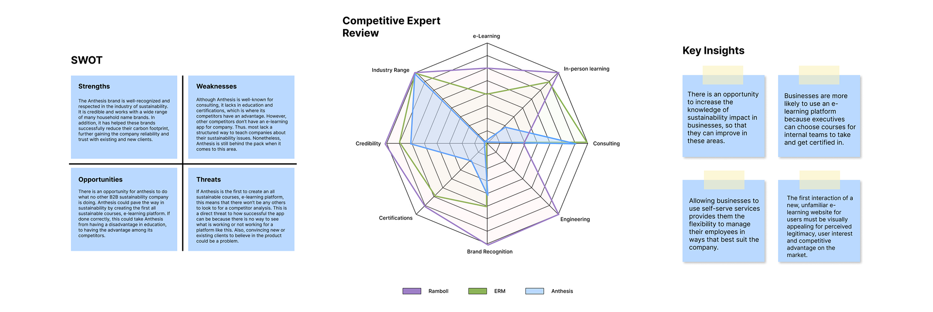
SWOT, Competitive Expert Review, Key Insights
Primary Research: Interviews
My primary research focused on Interviews with key stakeholders, specifically targeting administrators, managers, and potential end-users. This phase was critical for understanding the qualitative aspects.
Questions Answered:
What are the key user needs and expectations for an e-learning app?
How do users track their progress and achievements?
What experience does the administrator expect when adding students to a course?
Effectiveness: The interviews were highly effective in revealing deep-seated pain points that generic courseware often misses: Administrator Pain (lack of control and ease of student management) and Student Pain (pre-conceived negative assumptions about mandatory learning, leading to fatigue and disengagement). This phase confirmed that the solution must be equally focused on self-service tools for the employer and interactive design for the employee.
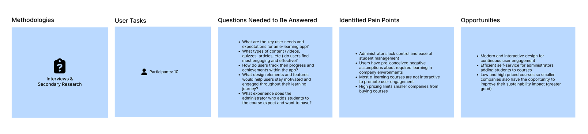
Primary Research Methods
2. Defining Findings
Key Insights:
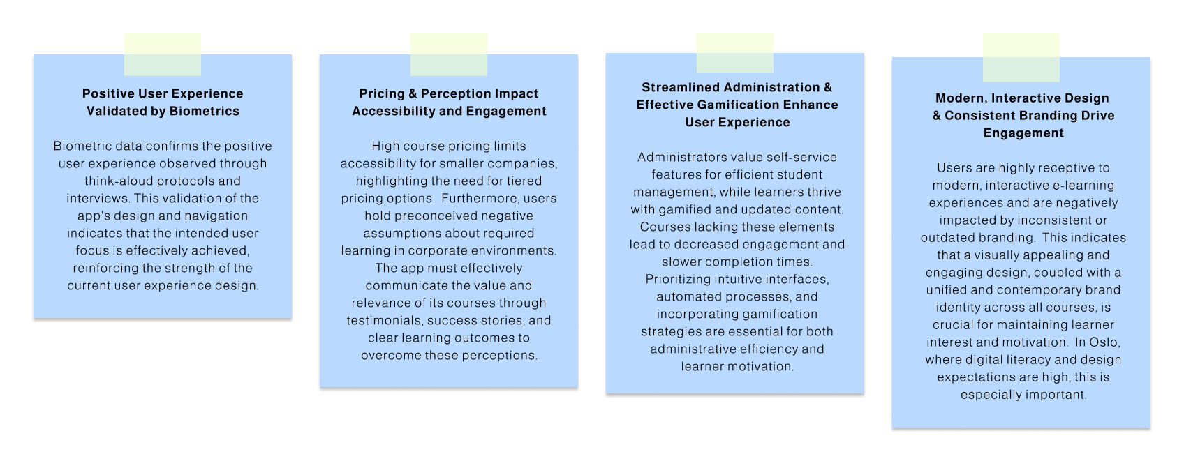
This stage was pivotal for translating the raw research—which covered both employer management friction and the sustainability knowledge gap—into an actionable problem set. I rigorously synthesized pain points into Strategic Insights, which identified the core operational and psychological truths driving the need for this B2B solution.
Strategic Insights: I converted observations like "Employers want streamlined management" and "Companies are unsure how to apply sustainability efforts" into powerful, dual-focused insights. For the buyer, the insight became: The platform must deliver streamlined self-service efficiency to track employee progress and validate the training investment. For the employee, the insight was: The learning must overcome fatigue by providing a clear, step-by-step roadmap to translate abstract sustainability goals into concrete, measurable business applications (leading directly to carbon footprint reduction).
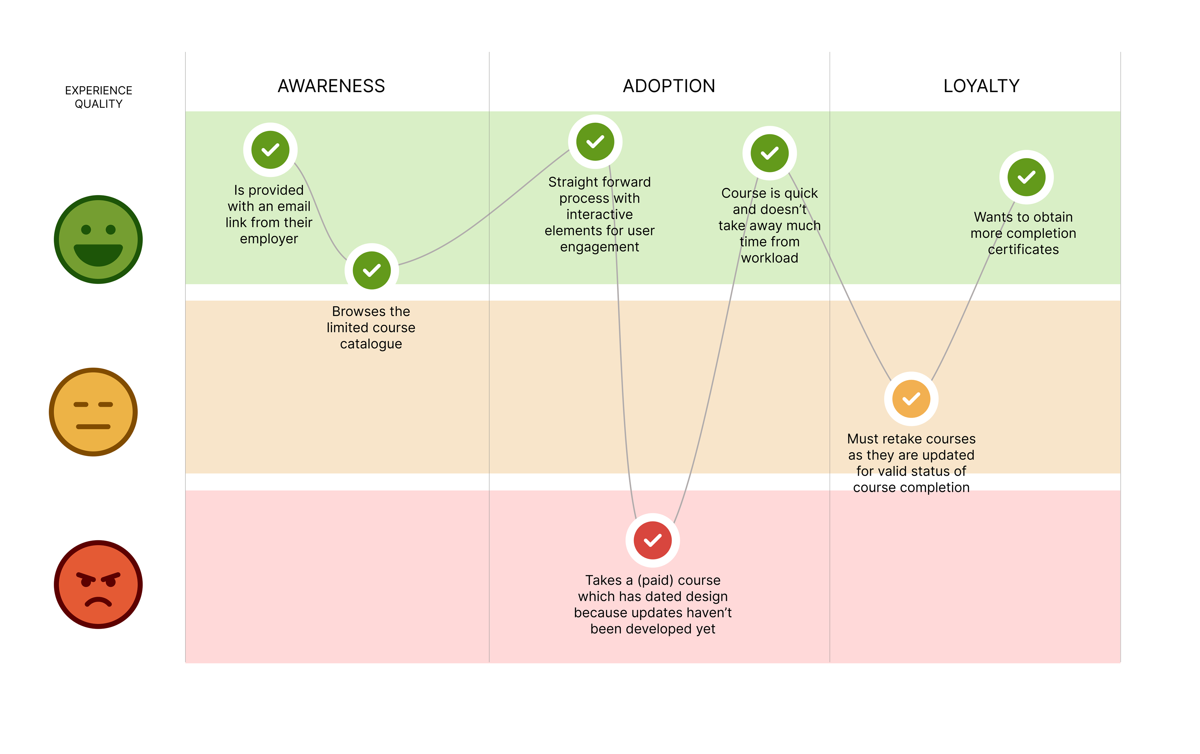
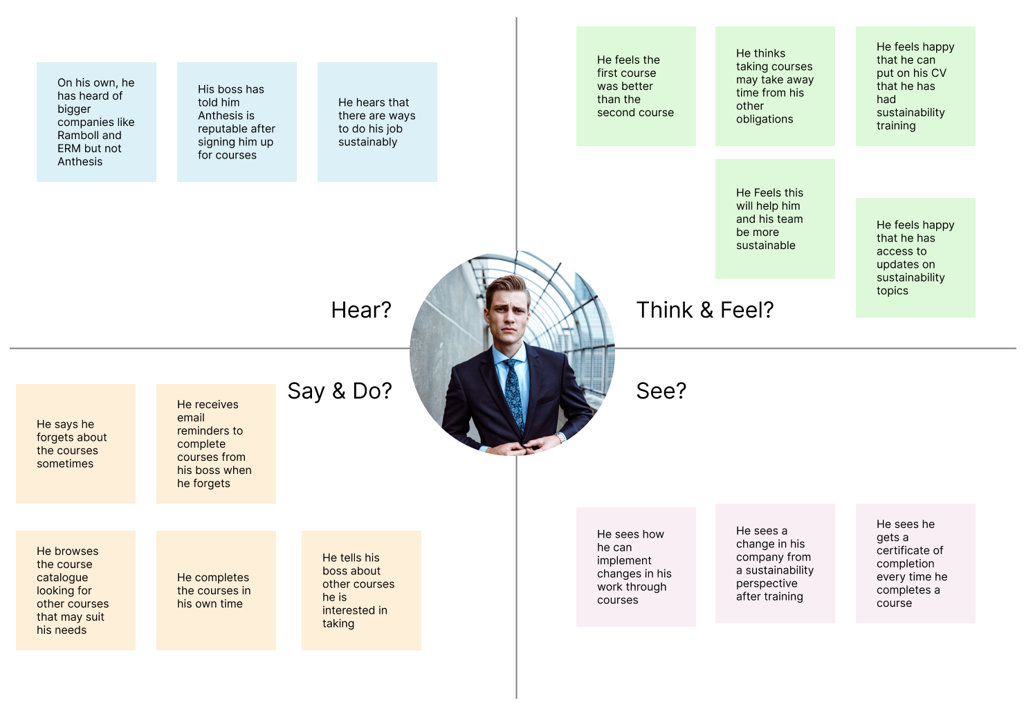
Emotional & Empathy Maps: I developed Emotional Journey Maps to pinpoint moments of friction for both the manager (buyer) and the employee (user). Simultaneously, Empathy Maps provided a holistic view of what each group Says, Thinks, Does, and Feels regarding mandatory learning and climate action. This visualization ensured the resulting Personas were robust, allowing me to define a solution that satisfies the manager's need for reporting while meeting the employee's need for engaging, applicable content.
By completing this synthesis, I successfully defined a challenge that requires integrating efficient administrative oversight with engaging, results-driven learning, setting the stage for the Ideation phase.
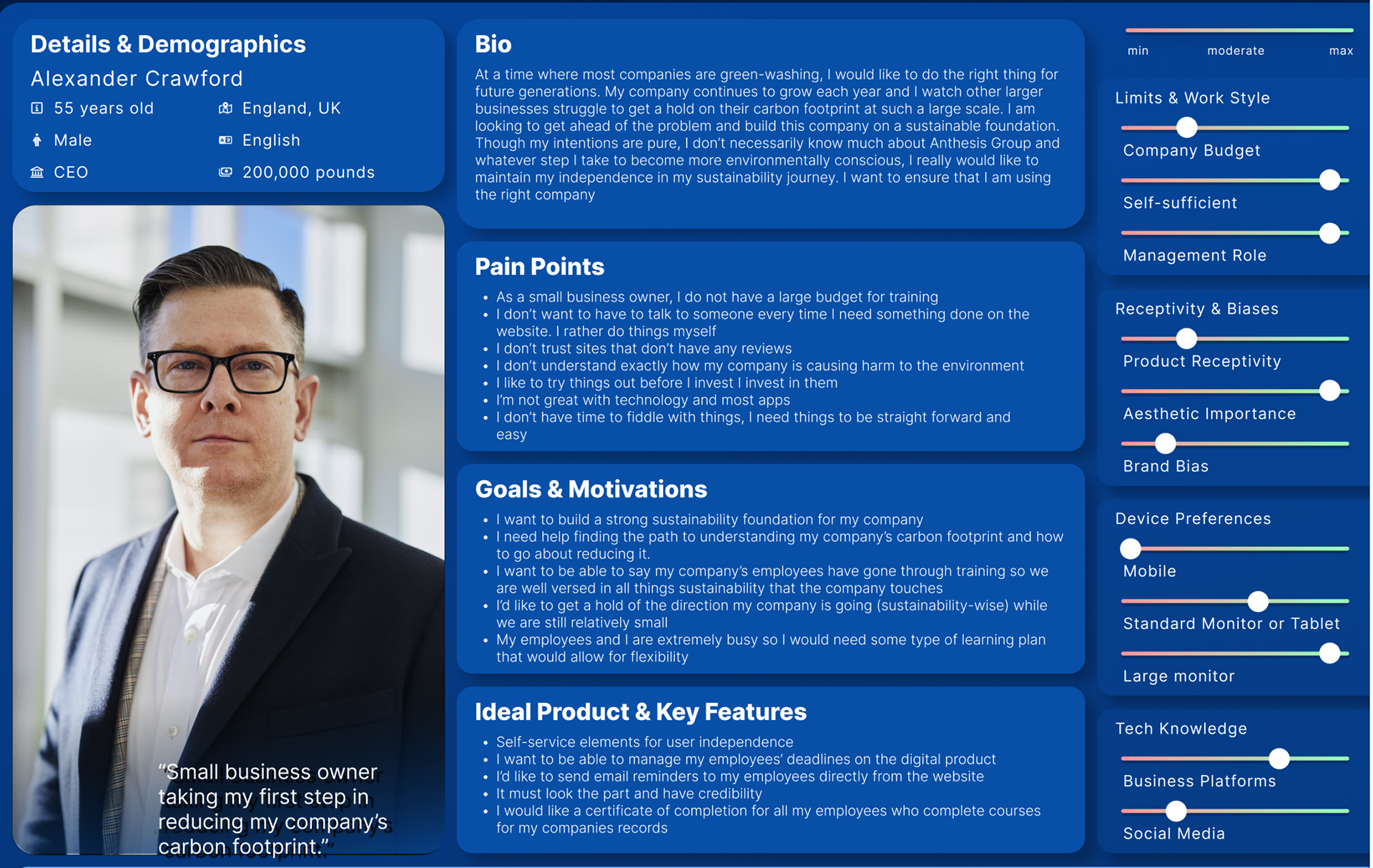
Persona
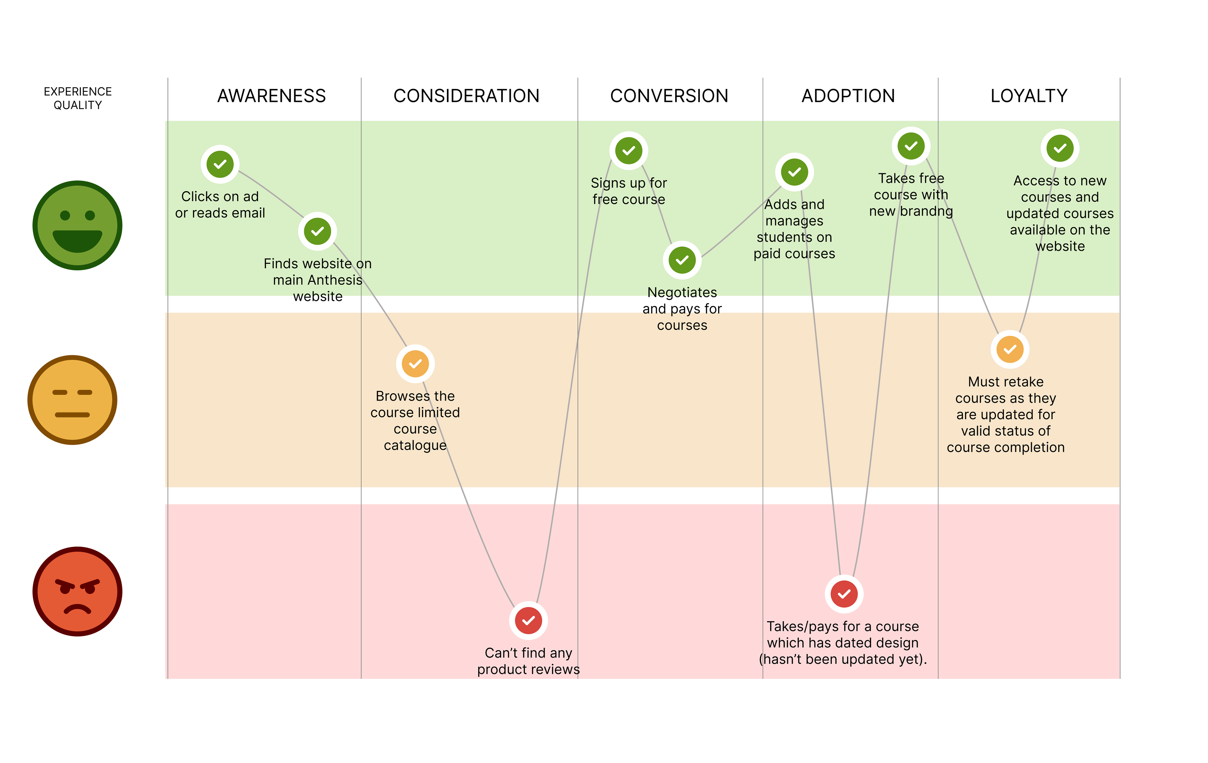
Emotional Journey Map
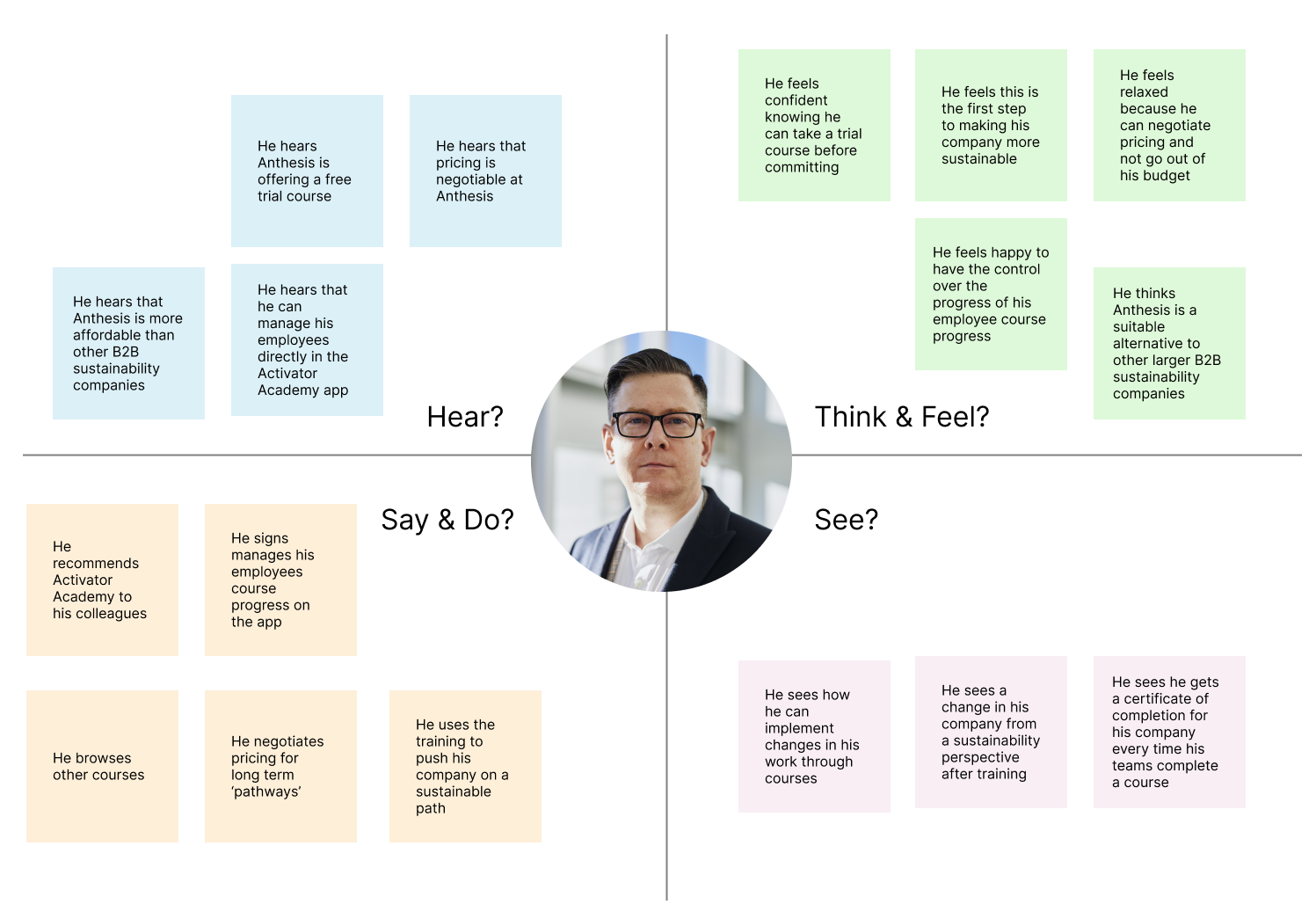
Empathy Map
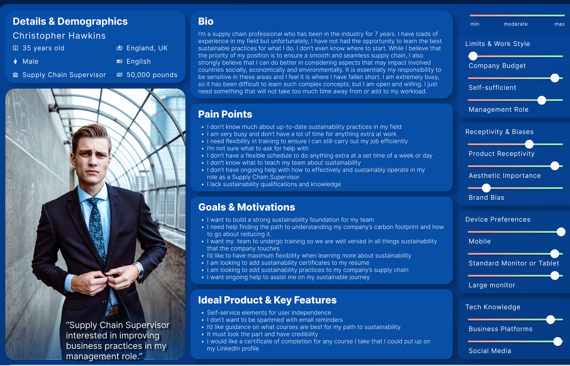
Persona
Emotional Journey Map
Empathy Map
3. Ideation
Features List
The development of these key features was a direct response to the validated pain points and opportunities identified across both the administrative and student user groups in the e-learning project.
1. Addressing Administrative and Buyer Friction
The features were designed to directly solve the primary pain point for the buyer (employer/administrator): "Administrators lack control and ease of student management".
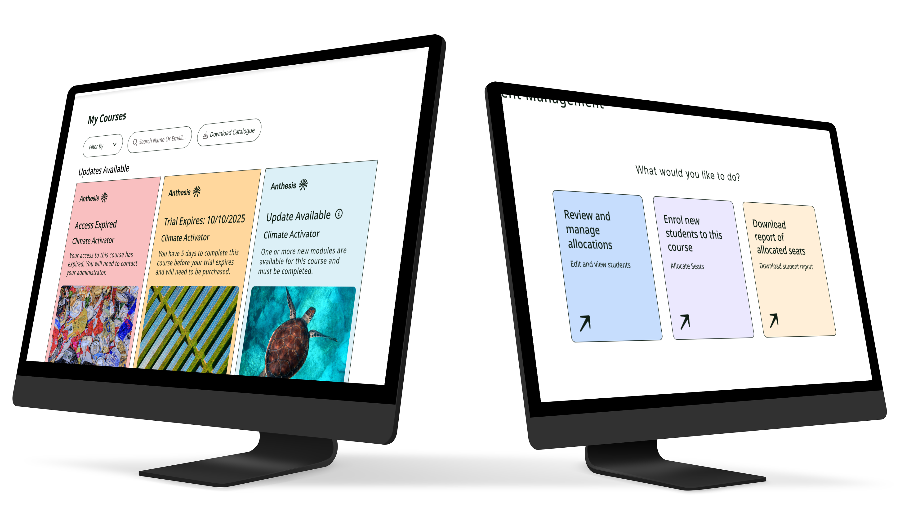
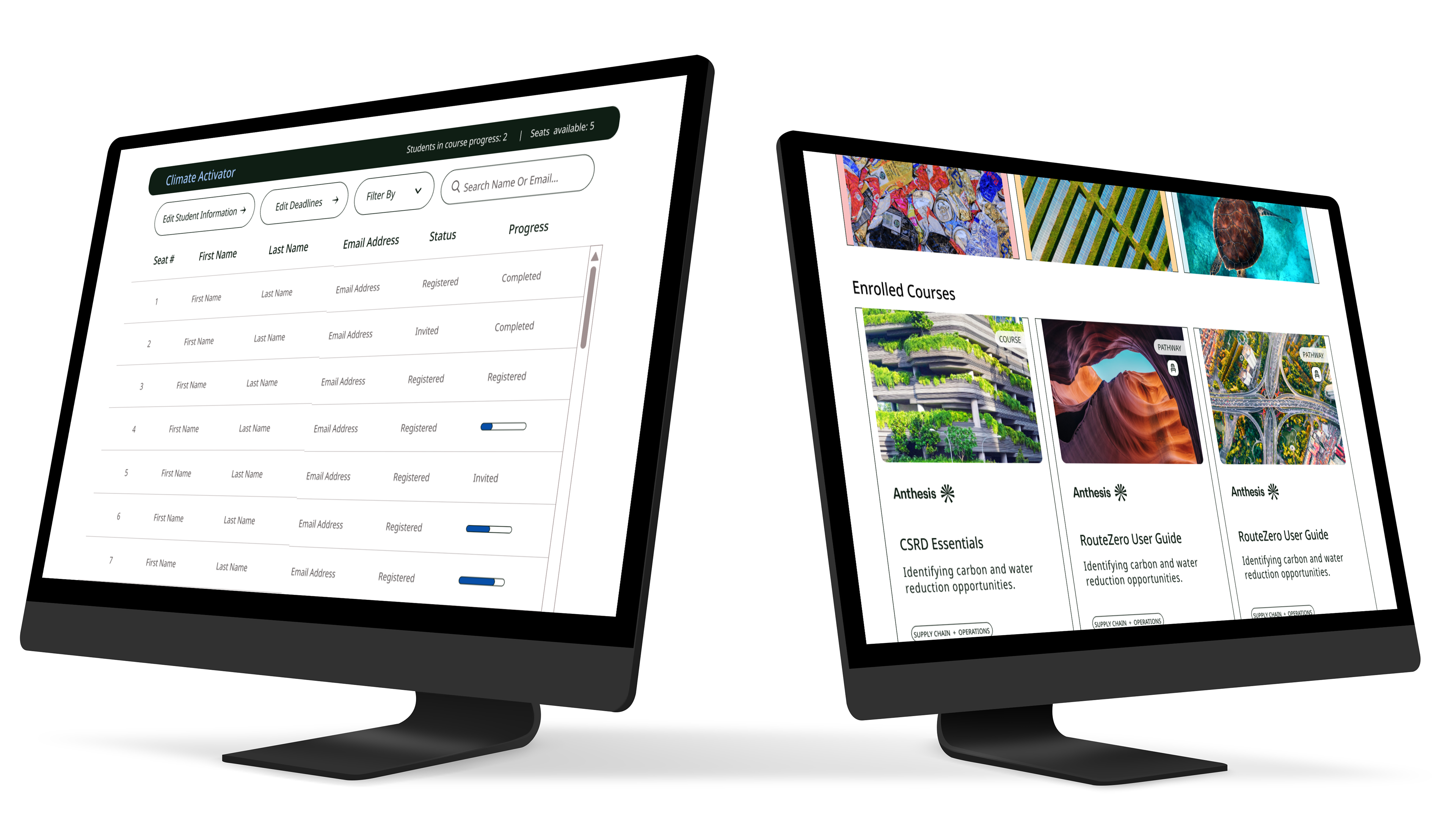
Student Management: This feature is the immediate, essential solution to the administrative pain point. It grants administrators complete control to manage enrollment, set deadlines, and track progress, ensuring the platform offers "Efficient self-service for administrators" and validates the investment for the employer.
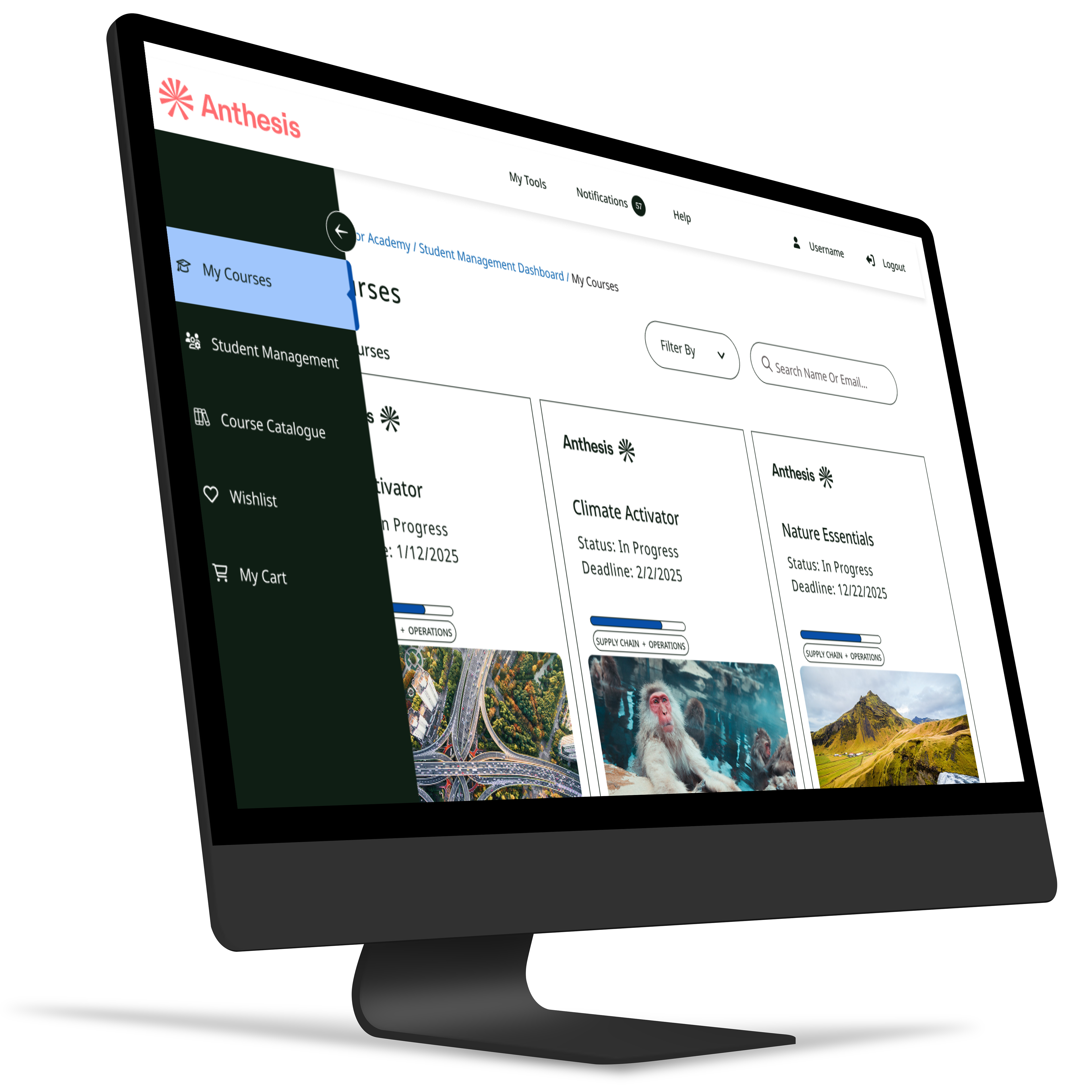
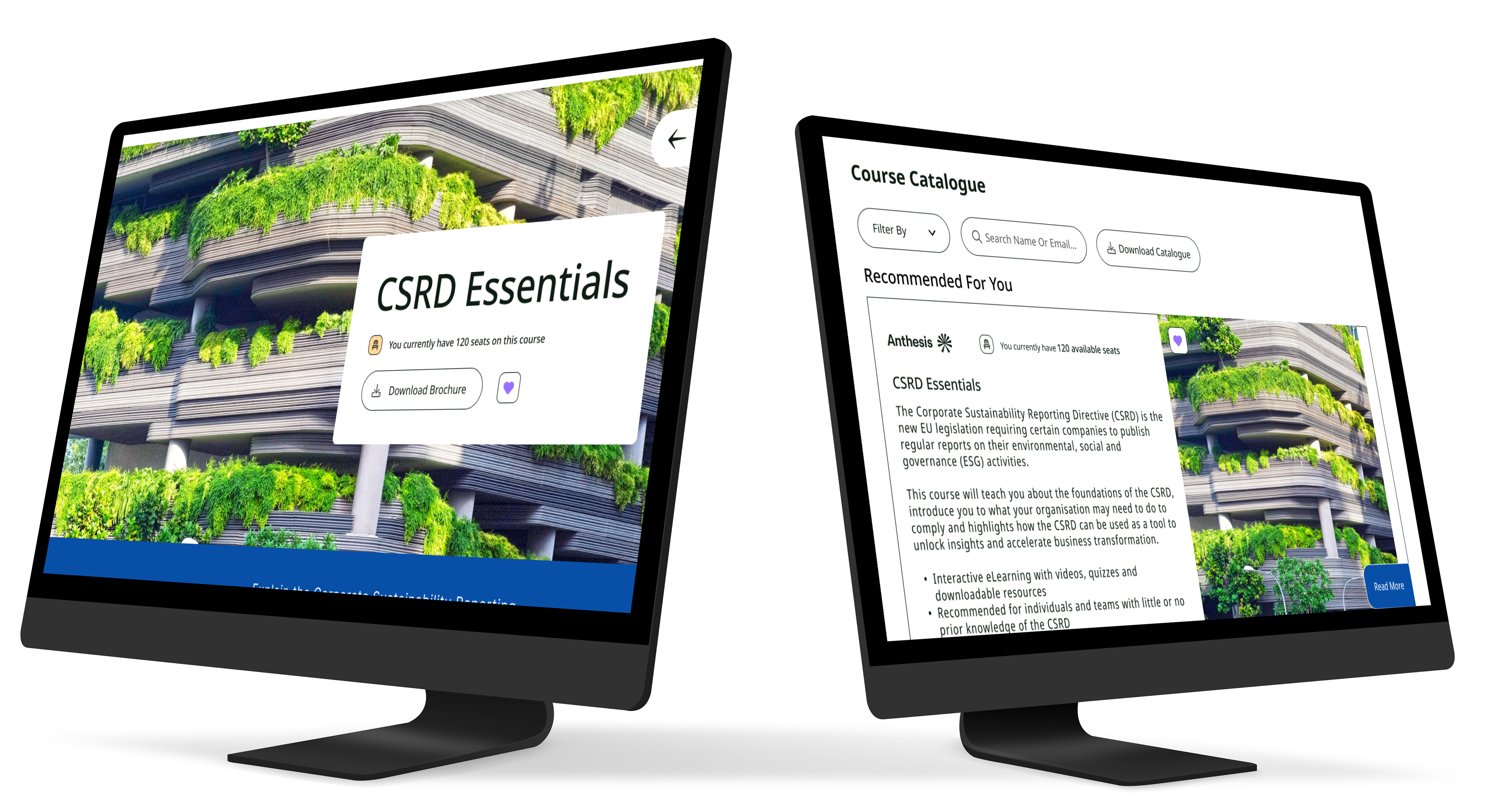
Course Catalogue (for Administrators): Providing administrators with browsing access enables them to easily discover relevant courses to improve their company's sustainability impact.
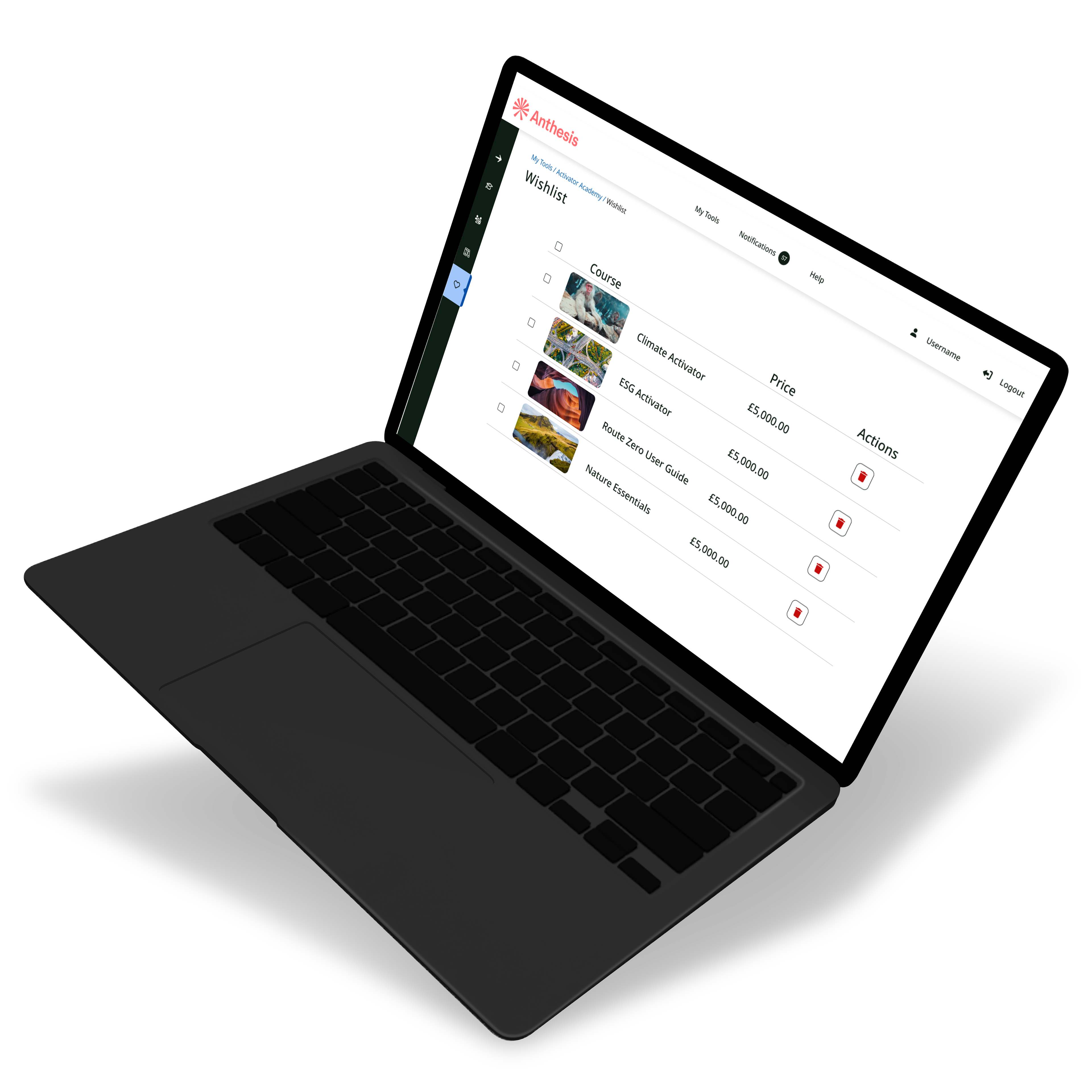
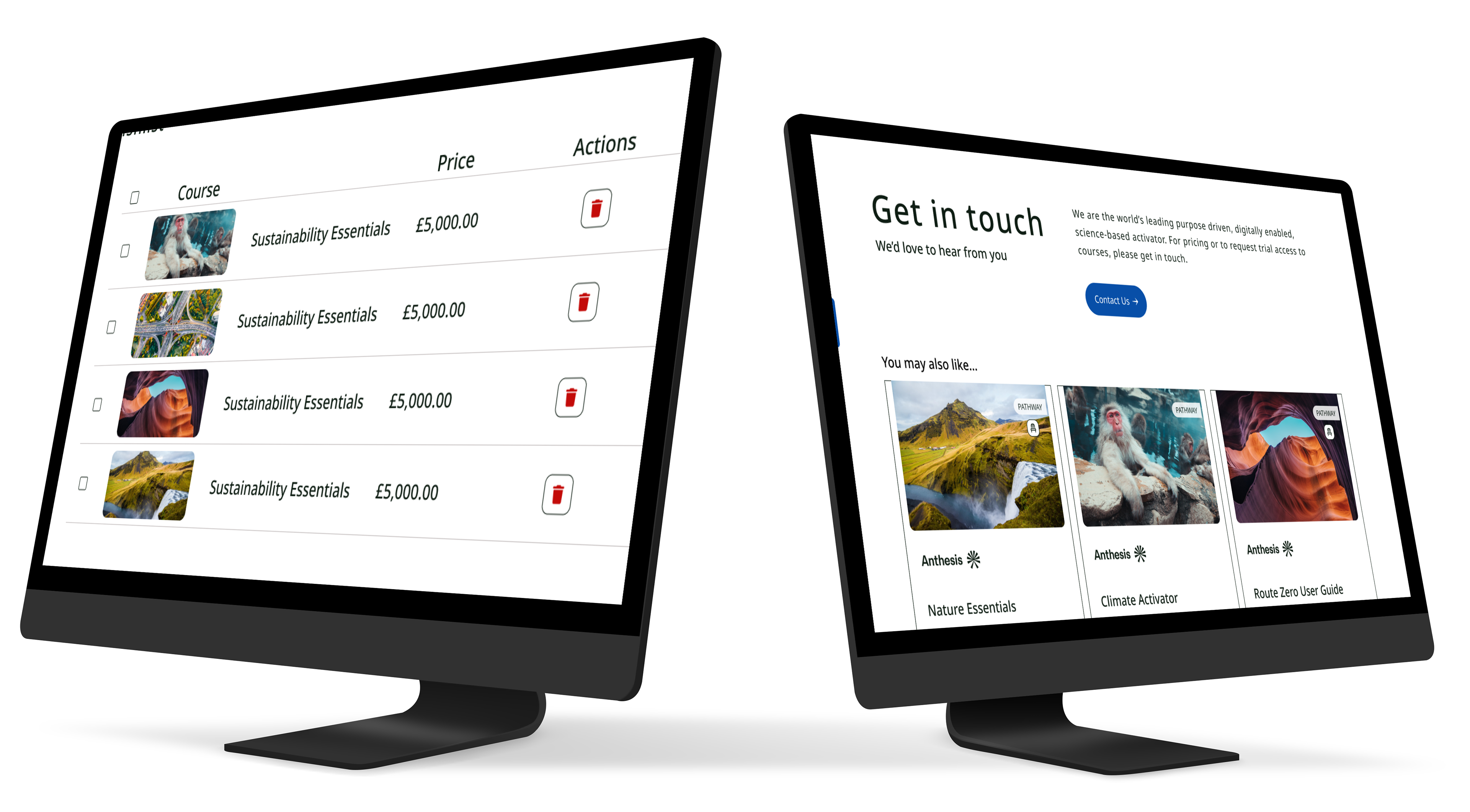
Wishlist (for Administrators): This allows administrators to track desired courses for future purchase or budget planning, aligning with the need for better control and long-term planning.
2. Addressing Student Fatigue and Engagement
The features address the primary student pain point: "Users experience fatigue when forced to take courses by their employer".
My Courses: This is the core solution for the learner, allowing students to take courses and track their progress. This self-tracking element is critical for maintaining motivation and providing a sense of achievement and progress, countering the fatigue associated with mandatory learning.
Course Catalogue (for Students): Giving students the ability to browse the catalogue is part of promoting "continuous user engagement", ensuring a modern, interactive design that encourages them to explore content rather than simply being assigned it.
Wishlist (for Students): This promotes engagement by allowing users to add desired courses, giving them a sense of control and future motivation over their learning journey.
The combination of features ensures the platform serves as a powerful solution that balances the employer's need for oversight with the employee's need for autonomy and engagement.
The Card Sorting exercises were critical during the Define/Ideate transition to ensure the application's information architecture aligned with the mental models of both user types. I ran parallel card sorts for the Learner and the Buyer to validate two distinct navigation structures.
Learner's Card Sort: This focused on content categorization and led to an intuitive flow centered on course progression ("My Courses," "Wishlist") and browsing (Course Catalogue), ensuring the student could easily stay engaged.
Buyer's Card Sort: This focused on administrative tasks, defining the necessary hierarchy for efficient Student Management and progress tracking, which was a core pain point for administrators.
The resulting Learner's User Flow and Buyer's User Flow acted as blueprints, visually mapping out every key transaction, from browsing a course to the complex, multi-step process of "Assign Students to Course" or "Remove Students." By validating the information architecture through card sorting, I was able to create detailed user flows that eliminated potential friction points, leading to a highly efficient and self-service platform design.
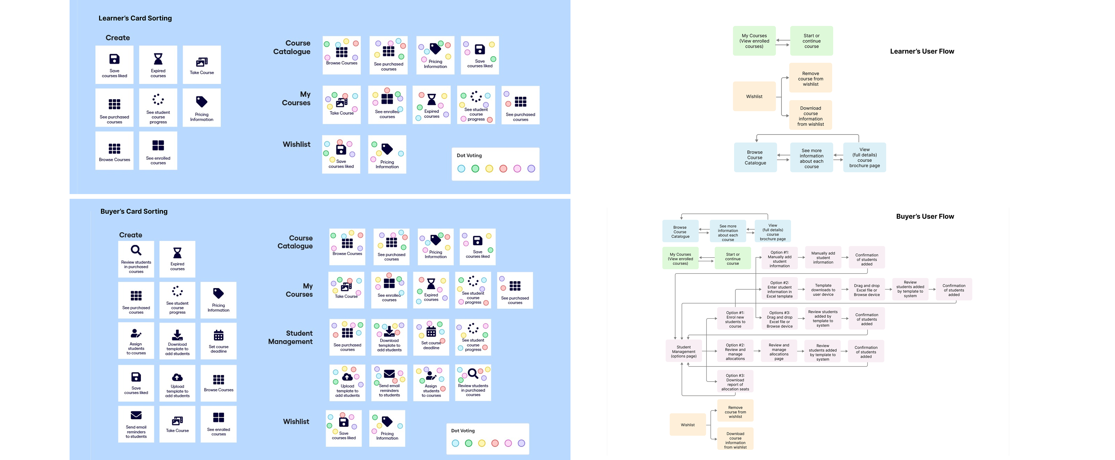
Card Sorting & User Flows
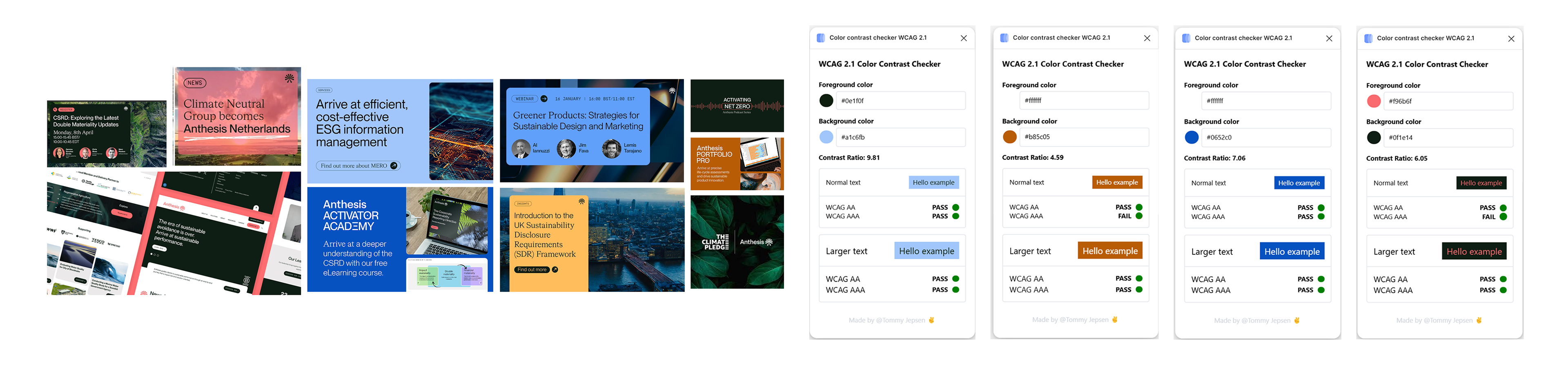
Branding Accessibility Issues
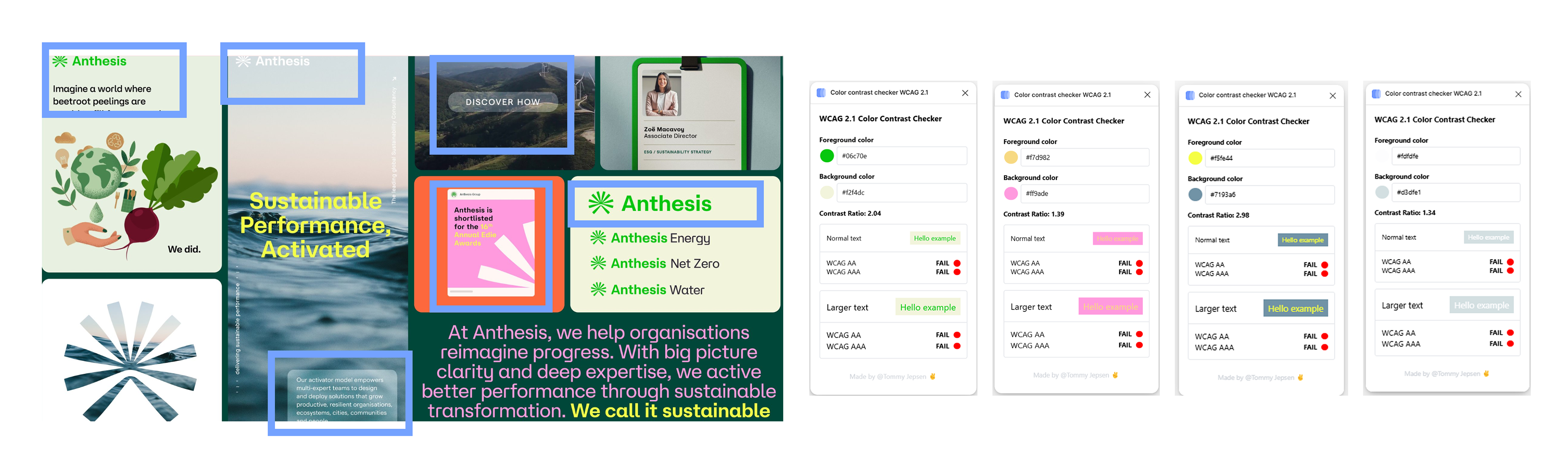
Branding: Before My Help
A critical audit of the original Anthesis brand revealed deep structural problems: a failure to adhere to WCAG compliance and a highly inconsistent visual language. This instability translated directly into a poor user experience, where the visual chaos significantly increased the cognitive load on the user. This undermined the platform's perceived value and the credibility of its sustainability expertise by making the mandatory learning environment feel overwhelming and untrustworthy.
Branding: After My Help
My intervention successfully stabilized the Anthesis brand identity by establishing a cohesive visual language. This strategic consistency not only achieved WCAG standards but also served to immediately relieve user cognitive load. The resulting clarity fortified brand recognition and professionalized the entire learning experience, confirming the platform's reliability for both employees and administrators.
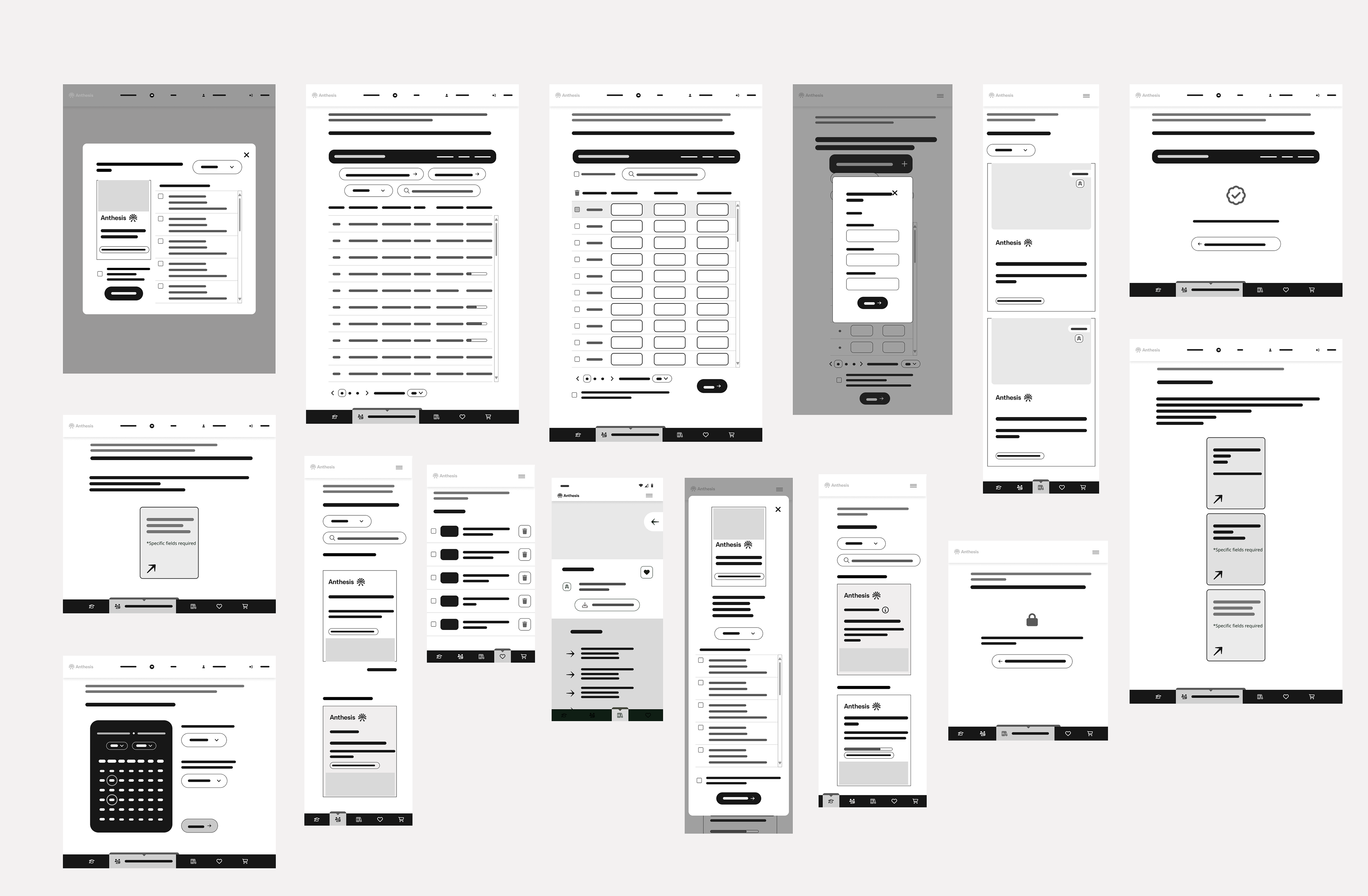
Wireframes
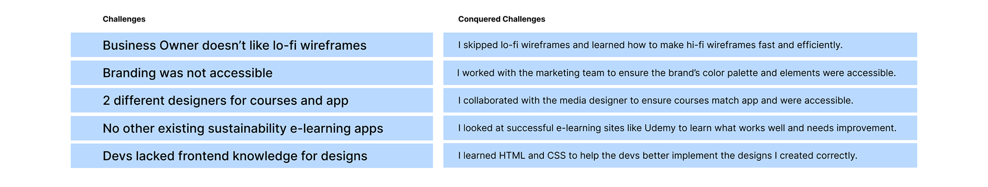
Challenges Conquered
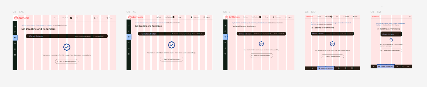
Breakpoints
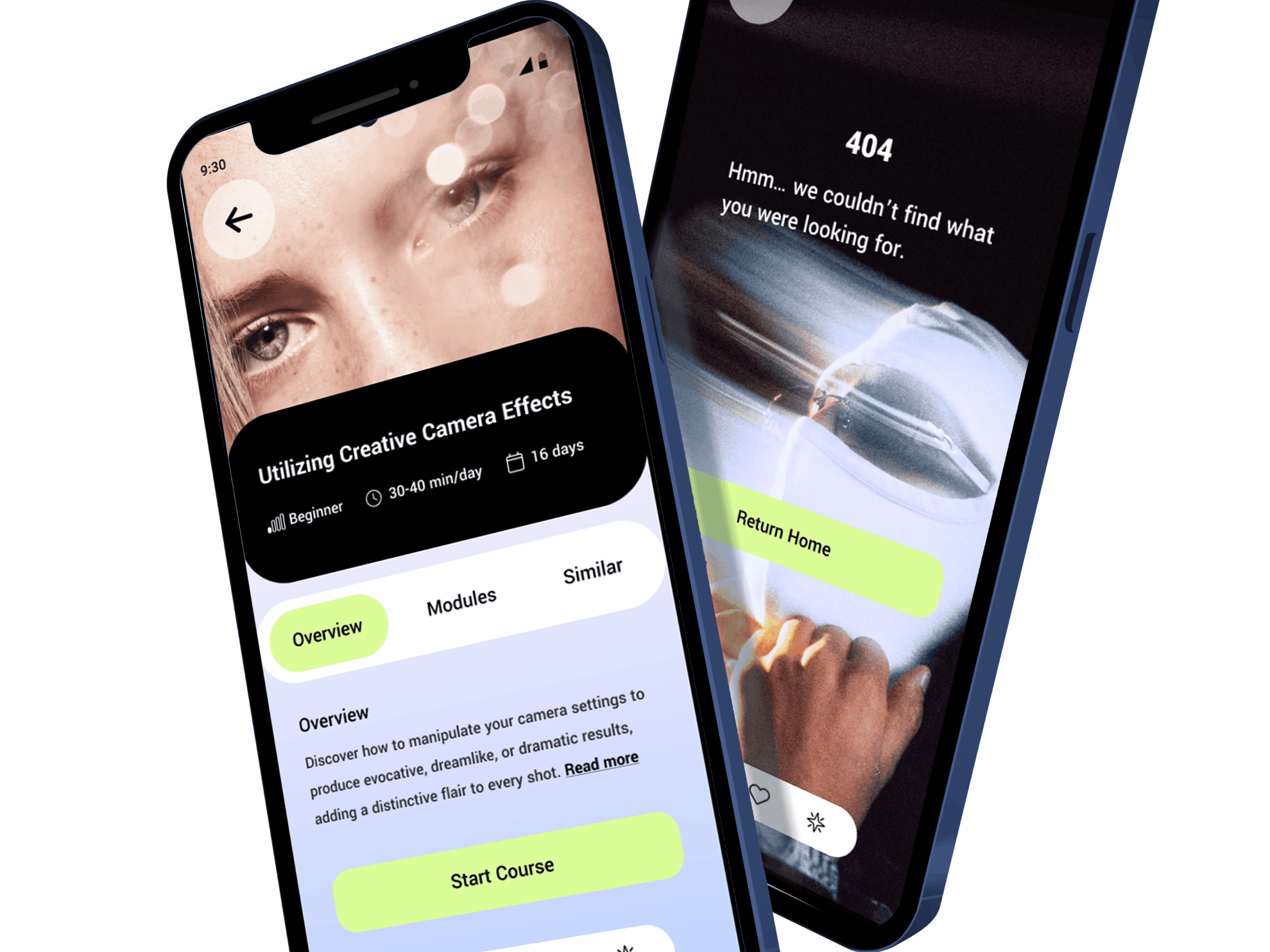
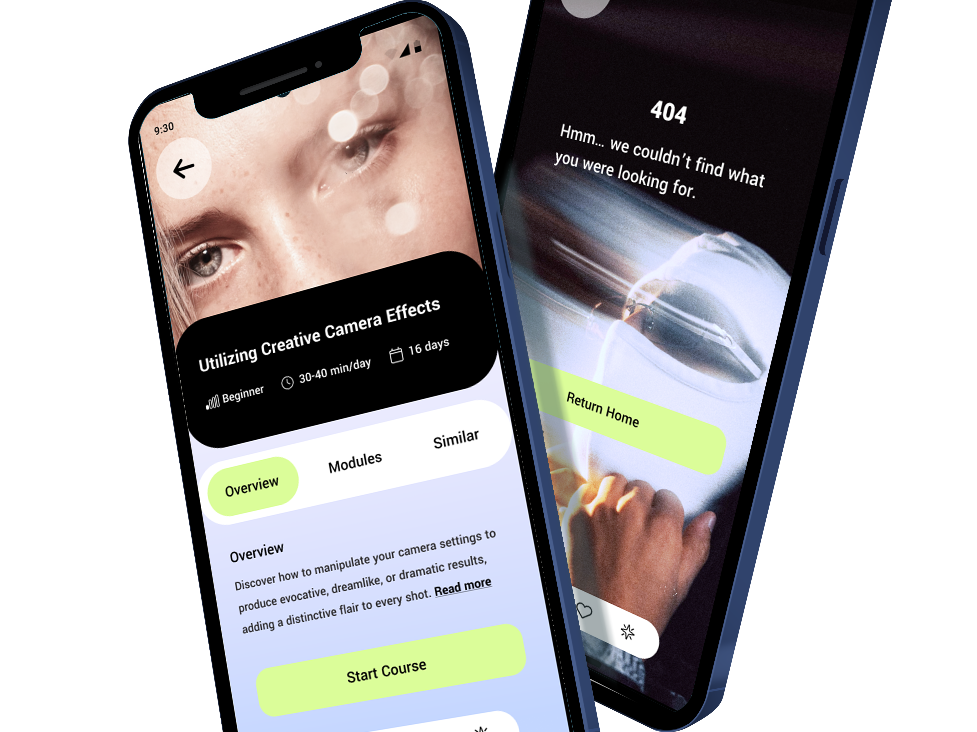
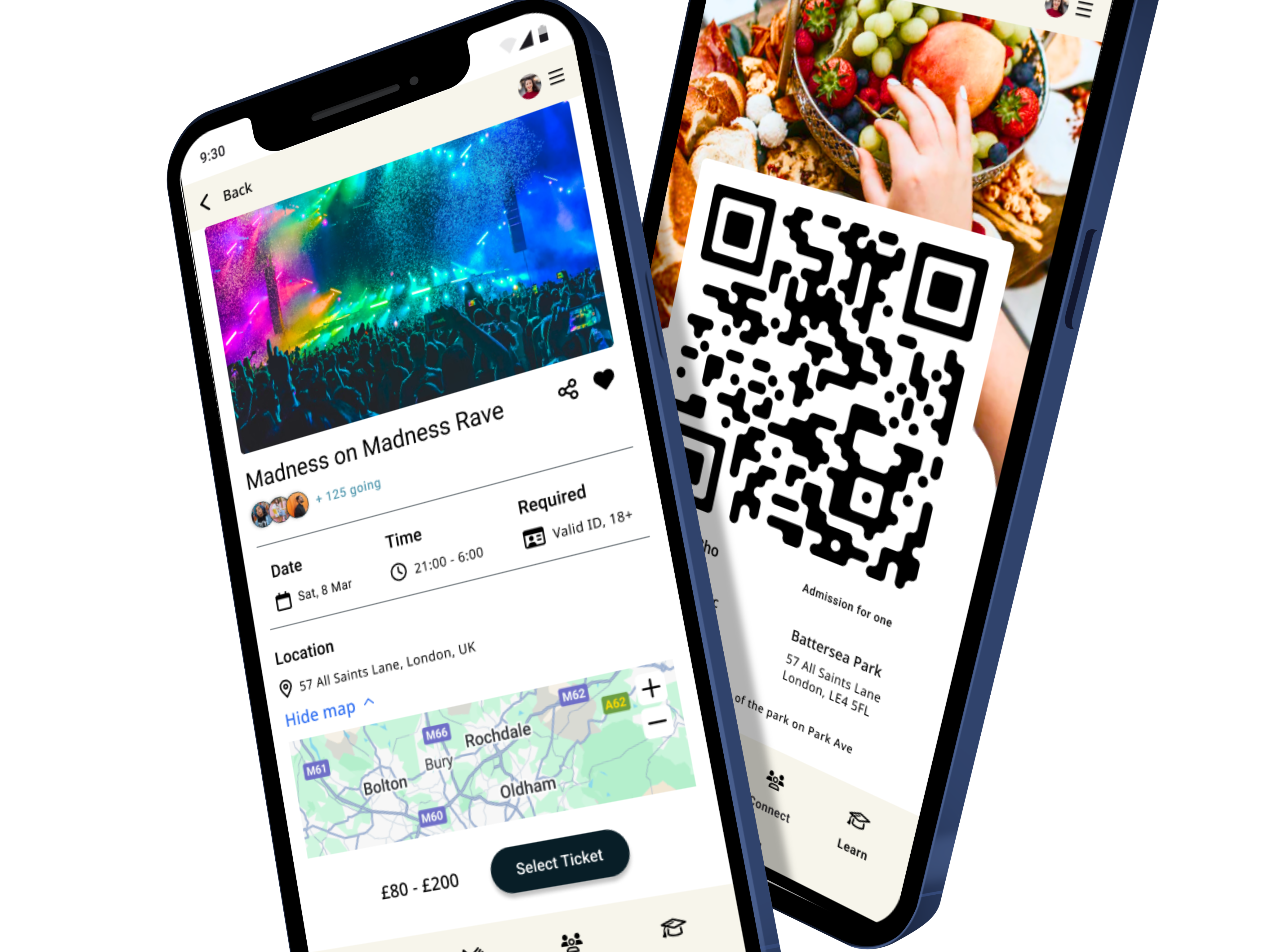
Course Details Page
Wishlist Page & Contact Section
Course Updates and Student Management Pages
Course Details Page (Sections)
Track Student Progress & Enrolled Courses Pages
4. Prototyping
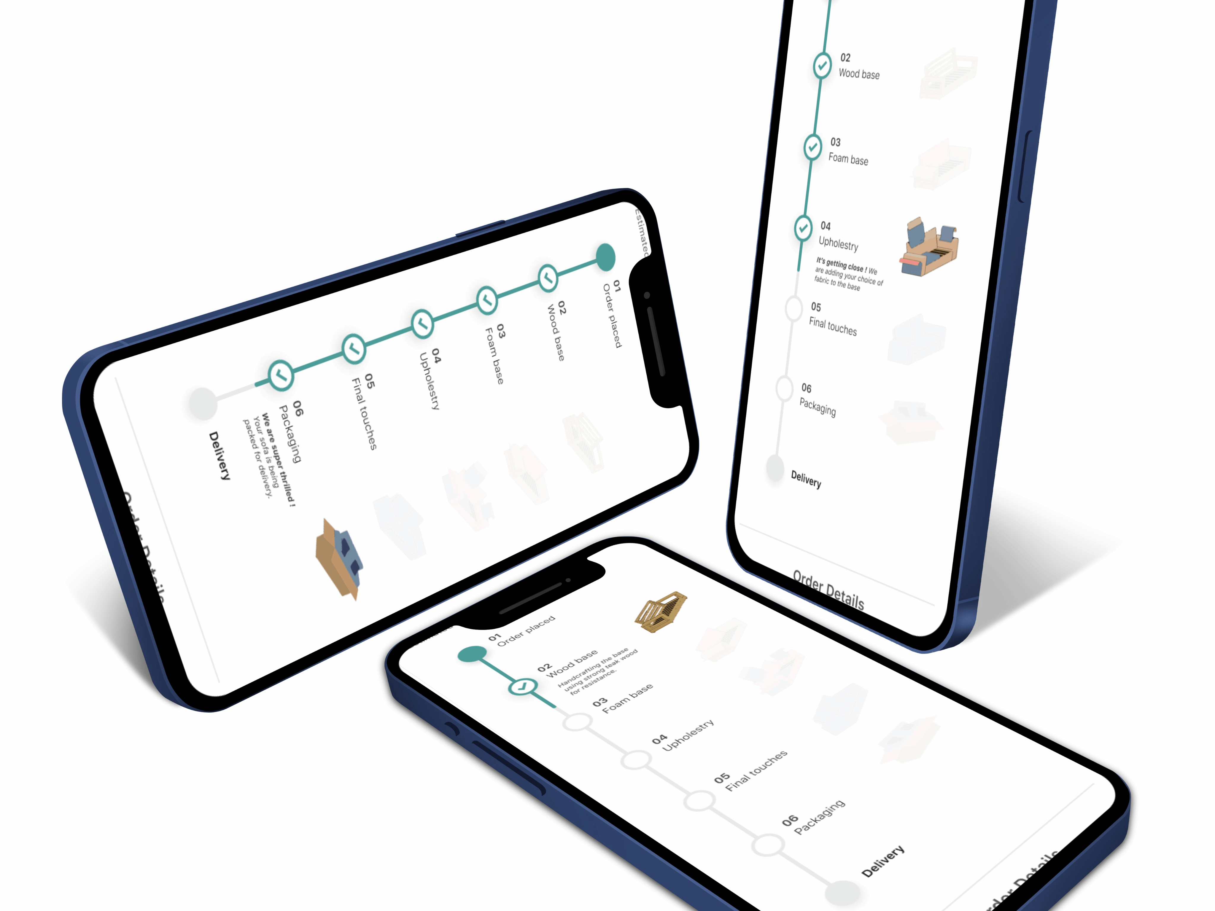
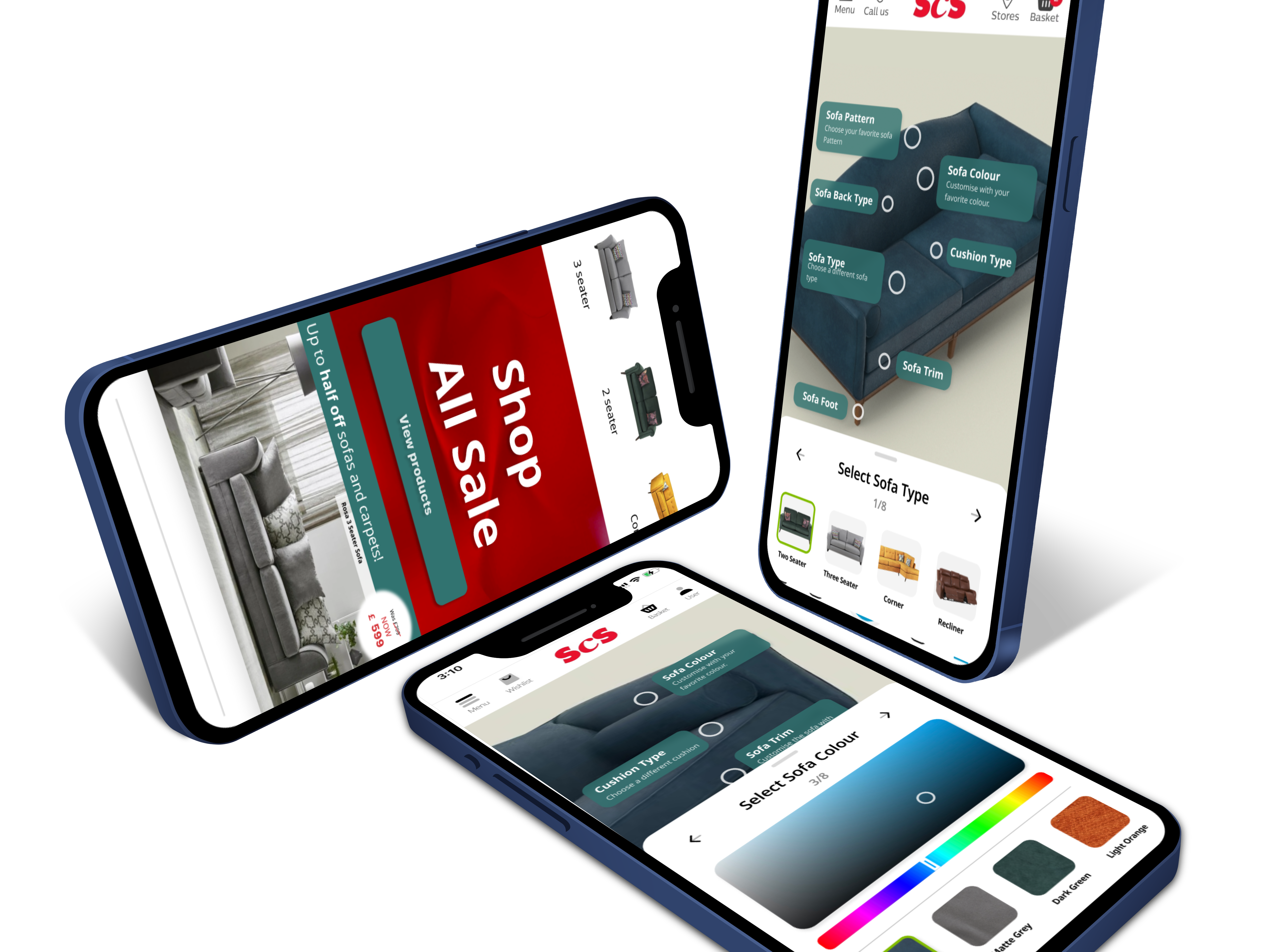
Student Management Pages (Administrator Access Only) Flow
Student Course and Course Progress Pages Flow
Browse Course Catalogue Pages Flow
5. Testing
Effectiveness of Testing and Log Analysis
The integration of Think Aloud Protocols, AI Biometrics (Eye Tracking), and Server/Query Logs proved highly effective by addressing both the behavioral (what users did) and emotional (how users felt) aspects of the e-learning experience.
Validating Design and Engagement (Usability Testing)
My usability testing, involving 25 participants in Think Aloud Protocols, provided essential qualitative validation:
My usability testing, involving 25 participants in Think Aloud Protocols, provided essential qualitative validation:
Positive Outcome: Users responded strongly to the interactive and modern feel of the courses, with all participants completing the core course tasks without major functional errors. Administrators specifically valued the new self-service features, confirming that the "Student Management" tools were functional and easy to use.
Targeted Negative Feedback: Crucially, the testing revealed a clear disconnect between the platform's new branding and the outdated branding still present in some legacy courses. This pinpointed the exact content that needed immediate updating with gamification and a modern feel, preventing a future drop-off in those specific areas.
Biometric Confirmation: AI Biometrics (Eye Tracking) with 100 participants confirmed that the new design successfully created high 'Excitedness' levels and directed user focus to the intended elements, validating the success of the visual language redesign and navigation.
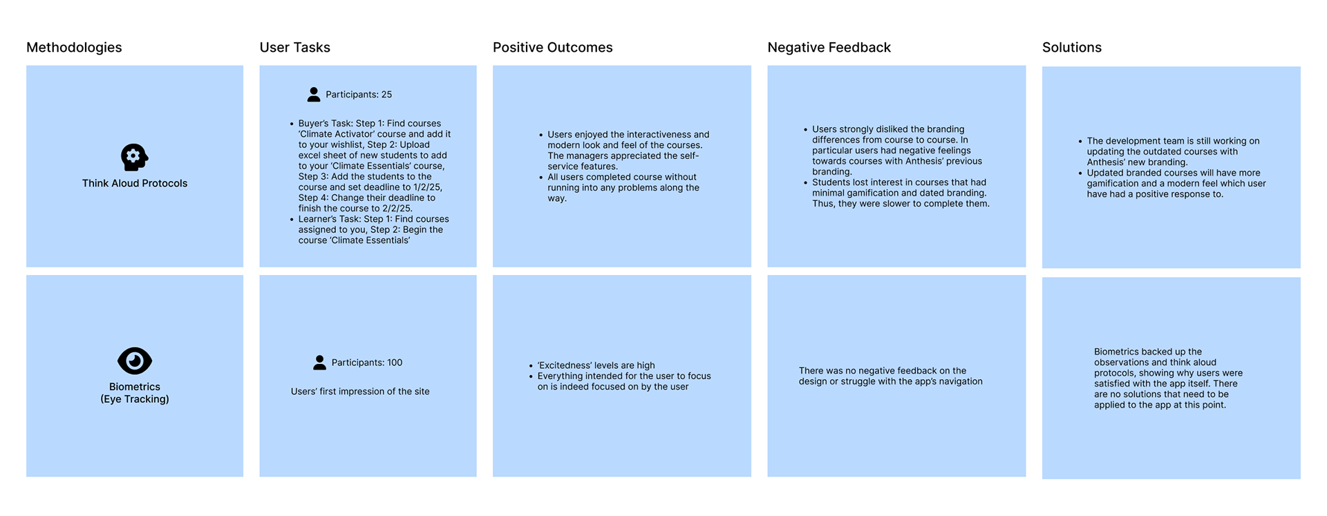
Usability Testing Methodologies
Eliminating Critical Friction (Log Analysis)
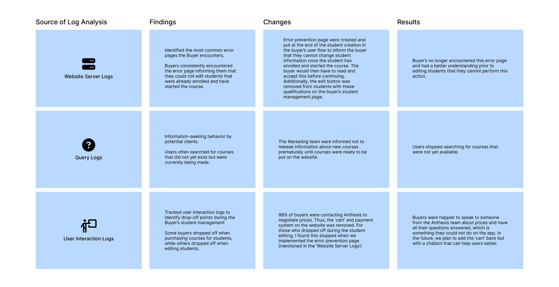
The analysis of Website Server Logs, Query Logs, and User Interaction Logs provided the quantitative evidence needed to remove high-friction administrative pain points:
The analysis of Website Server Logs, Query Logs, and User Interaction Logs provided the quantitative evidence needed to remove high-friction administrative pain points:
Error Prevention: Server logs identified the most common error page: buyers trying to edit students who had already enrolled or started a course. The implementation of a new error prevention page at the point of student creation—requiring the buyer to read and accept terms—immediately resolved this error and stopped the resulting drop-offs.
Information Management: Query logs showed that potential clients were searching for courses that were not yet available. This insight allowed the Marketing team to adjust their release schedule, which was immediately effective in stopping users from searching for unavailable content, improving the perceived completeness of the platform.
Pricing Friction: User Interaction Logs tracked drop-off points during the purchasing process. This analysis led to a significant strategic change: the removal of the self-service cart and payment system entirely, as 98% of buyers preferred to contact Anthesis directly to negotiate prices. This change immediately led to happier buyers who felt they could speak directly to the team, thus streamlining the conversion funnel by focusing on human interaction over automated checkout.
In short, the testing and analysis were effective because they solved administrative friction with data and validated student engagement with user feedback, ensuring the final product was optimized for both business objectives and user satisfaction.
Log Analysis
Triangulation
Compared website traffic data with user support ticket data related to website usability to identify pain points.
Triangulated app usage data, user feedback and feature adoption to asses the success of the app's new features.
Matched sales data with user engagement metrics to see if increased engagement leads to higher sales.
Correlated in app help request data with the amount of time users spend on each page of the app to see if people are having trouble with specific pages in the application.
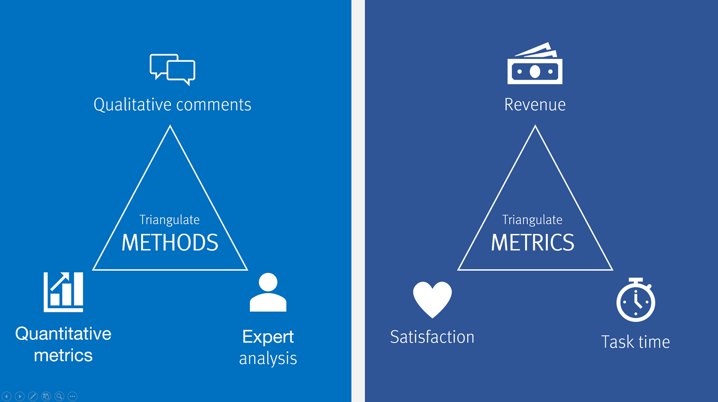
Triangulation
5. Results
Personal Reflection
Through Anthesis Group's Activator Academy, I gained invaluable insights into user behavior and learning methodologies while navigating the challenges of limited UX design resources provided by the company. This experience honed my ability to work efficiently under tight deadlines, guide teams towards user-centric solutions, and successfully deliver impactful products that meet both user needs and business objectives.
By creatively overcoming these resource constraints, I developed a strong understanding of resourcefulness and prioritization, essential skills for any successful UX Designer. My collaboration with the marketing team, helping them understand and incorporate UX principles, further broadened my understanding of cross-functional teamwork and the impact of UX on the broader business.
Through these experiences, I emerged as a more resourceful, collaborative, and impactful UX Designer, capable of delivering successful outcomes even in challenging environments.